Bring Me Your Higher Love
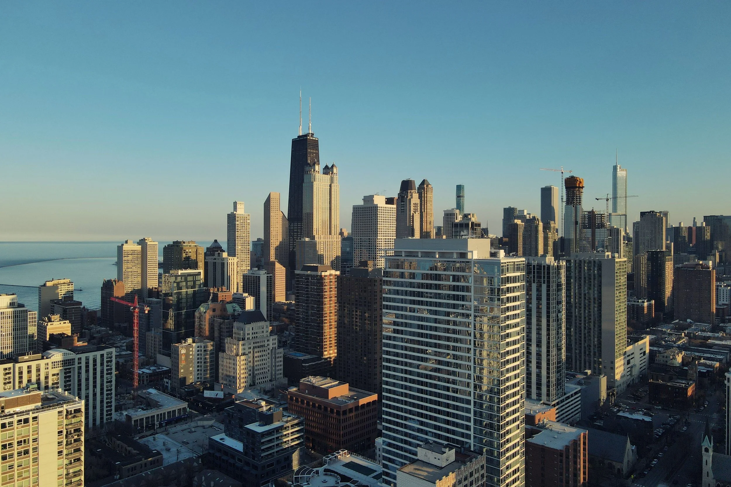
Areal shot of the Chicago Skyline by Gustavo Fring via Pixels
Building infill housing near transit stations has many benefits, including addressing housing supply shortages that make owning and renting a home more expensive, making it easier for people to choose transit, and reducing people’s carbon footprint by adding energy efficient buildings. Building infill housing near transit stations also has many challenges, including construction costs, time spent on receiving approvals, and nearby residents opposed to adding density.
One challenge that does not exist is that there is simply not enough room to grow around stations. Following in the footsteps of architect Vishaan Chakrabarti’s 2023 New York Times Opinion Piece, “How to Make Room for One Million New Yorkers” my transit-oriented development platform, the National Transit Station Atlas includes a parking-to-housing conversion tool that estimates the number of homes that can be built on parking lots and parking garages within ½ a mile of transit stations without exceeding the highest building within a ½ mile of the station.
The main idea (described in “The Eight Types: A National Typology for Transit-Oriented Housing” a 2025 blog post written by myself and Kaisar Hossain Bhuyan), is that different transit neighborhoods require different development strategies. A parking lot in an exurban village served by commuter rail might be a candidate for two or three story row homes whereas a lot in a downtown neighborhood surrounded by skyscrapers could support a high-rise apartment.
The “Eight Types” blog post presented examples of different neighborhood forms, from industrial parks to suburban villages to sparsely developed downtowns to dense urban cores. But it did not provide total housing that could be built near transit. My estimates rested on a shaky foundation due to gaps in the OpenSteetMap data that my Atlas depends on. In particular, OpenStreetMap did not include data for all of the buildings that currently exists near transit and data on a building’s height was missing from most station areas.
However, in recent months, I have incorporated new data that allows me to provide parking to housing estimates with much more confidence. I’ll go into more detail on the new results in an upcoming post. This essay is about how I strengthened my data foundation.
OpenStreetMap and It’s Building Gaps
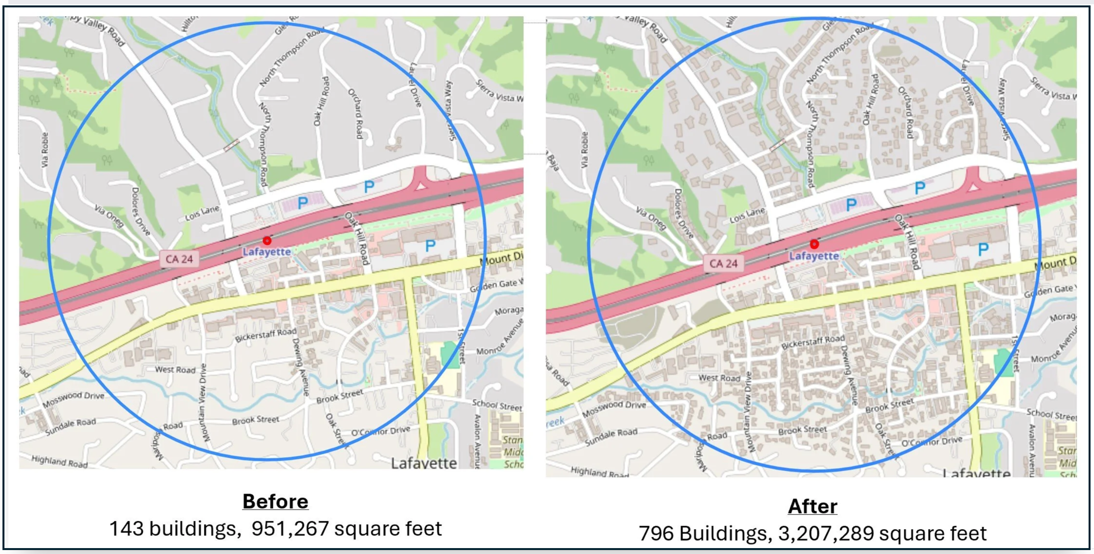
Left: An OpenStreetMap image of the area ½ mile around the BART Lafayette station in July 2024. Right: the same area after additional buildings were populated by the author, July 2024.
The National Transit Station Atlas’s built environment data and renderings are derived from OpenStreetMap (OSM), a collaborative mapping platform that allows people to contribute and edit geographic data, creating a detailed map of the world. OSM’s data is freely available for anyone to use, making it a powerful tool for a variety of applications.
OSM’s crowd-sourcing approach creates data quality strengths and limitations. On the one hand, the open platform means OSM is highly adaptable, constantly updated, and inclusive of local knowledge that might be overlooked by commercial tools. On the other hand, since contributions come from volunteers with varying levels of expertise, there can be inconsistencies in data quality, particularly in less populated or less frequently mapped areas. Urban areas with active mapping communities tend to have more accurate and detailed data than exurban areas and small towns.
I performed a visual scan of all of the transit stations in the Atlas in the summer of 2024 (and in December 2025 for new stations that came online in 2025) to identify “under-mapped” station areas, where buildings exist in reality but have not yet been added to OSM. It is relatively easy to spot under-mapped areas because the map shows street grids without corresponding buildings. For example, the map of the area around the Lafayette BART station (above left) shows a set of windy streets and cul-de-sacs north of California Highway 24 and south of Mount Diablo Boulevard with gray or tan spaces where structures should be.
This area is most certainly populated (theoretically it could be a new development construction site, and OpenStreetMap has a schema for marking development under construction). And it is possible to confirm housing via satellite imagery and add buildings via the OpenStreetMap editor, a process that I documented in my July 2024 post: Filling Data Gaps with OpenStreetMap. The process of adding buildings to the map is not technically difficult but takes time. It took me several hours over multiple days for me to fill in the missing housing and build out the map from 143 to 796 buildings.
Nationally, I tallied 817 under-mapped station areas (or about 16% of the 5,115 stations in the Atlas), which I defined as station areas missing buildings in at least half of the surrounding street network. Fifty-eight out of 110 transit systems in the Atlas have at least one under-mapped station. Commuter rail stations are under-mapped at 34% nationally, about twice the rate of all stations and stations in Pennsylvania (51.2% under-mapped), New Jersey (47.1%), Missouri (46.4%), Illinois (41.3%) and Ohio (38.2%) have more under-mapped areas than California, New York, Massachusetts and other states with many fixed guideway transit routes and stations. It’s possible that OpenStreetMap volunteer mappers are located or more interested in mapping the built environment in some states over others. The “Stations” csv file on the Atlas’s data page includes a column denoting whether a station is under-mapped.
Hiring a small army of volunteer mappers to fill in the gaps was not feasible, so my original Atlas version (published in April 2025) simply noted which stations are under-mapped, chalked it up to an organic data quality constraint, and hoped that the gaps would fill in gradually over time.
Obtaining complete and accurate data on building height has been a thornier challenge. The OpenStreetMap editor gives volunteer mappers the option of identifying a building’s height either as a direct value or in the number of building levels but does not require this information. A mapper has to choose to provide it. And while it is relatively easy to outline a building’s perimeter using satellite data, a top-down photo alone tells you nothing about how tall that building is. OSM height data typically comes from a mapper’s ground survey or personal knowledge. Notable buildings (such as historic skyscrapers) may receive particular attention and be tagged with publicly available data and, some cities and jurisdictions have released their own building datasets that have been imported into OSM wholesale. For the most part, areas with large numbers of buildings tagged with height are present where there is a large and active volunteer mapping community and sparse everywhere else.
When it comes to transit stations areas, only 15% of the buildings across all station areas are tagged with height metrics. 1,594 stations (32%) have 0% of buildings tagged with height, 2,758 stations (56%) have between 0-50% buildings tagged, 596 stations (12%) have 50-99% buildings tagged, and only 13 stations have achieved 100% height tagging. And even if a building includes a height tag, there is no easy way to ensure the height is accurate.
Global Building Atlas to the Rescue
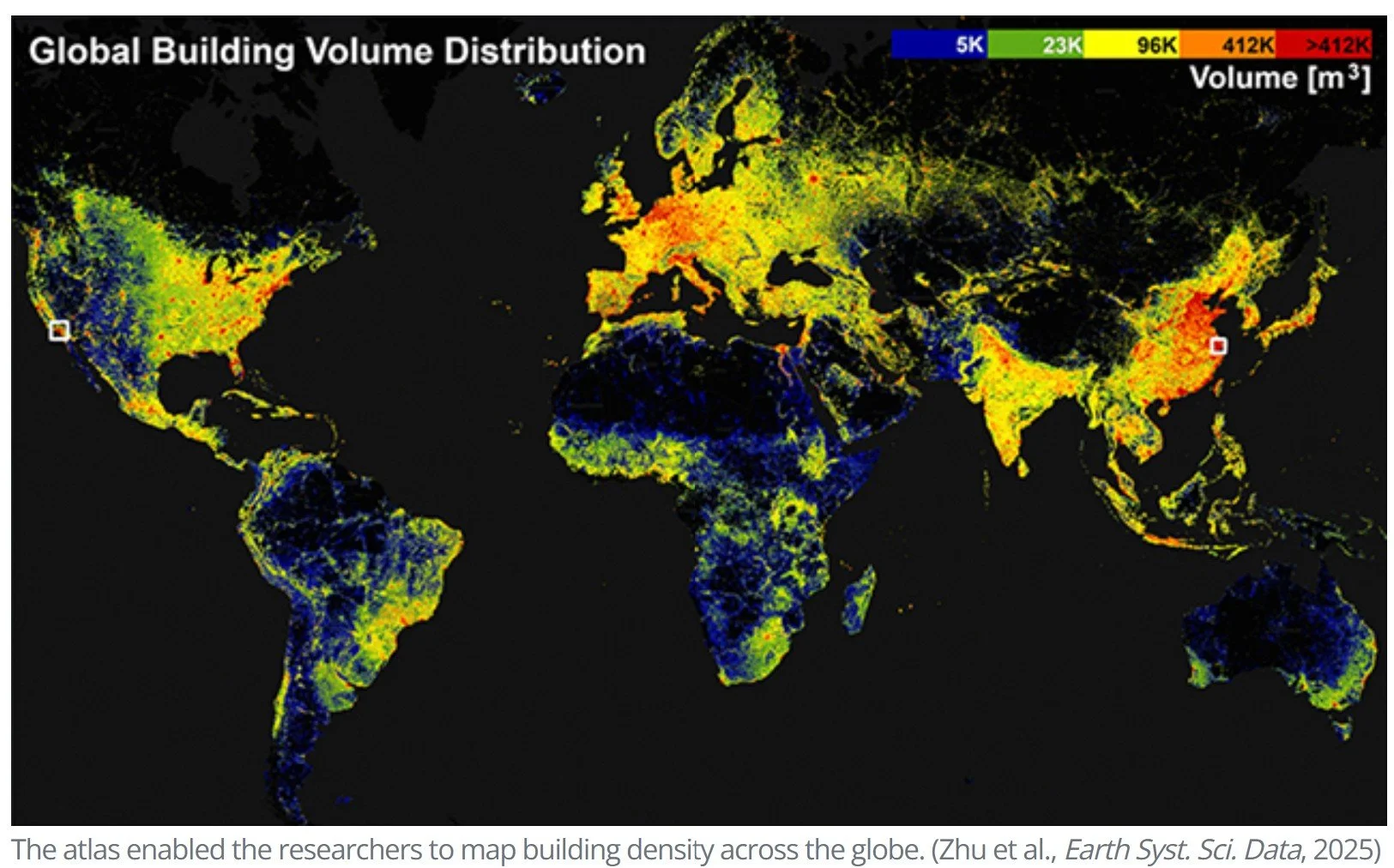
An image of summary data from the Global Building Atlas published in Science Alert, December 2025.
Several years ago, a team of researchers from the Technical University of Munich set out to answer the question: “How many buildings are there on Earth – and what do they look like in 3D?” The result is the Global Building Atlas, (GBA) published in December 2025 covering 2.75 building models from 2019 satellite imagery. Researchers developed a new foundational tool with applications for addressing climate change, identifying disaster risks, and promoting sustainable development. For example, the GBA could be use building volume data to better understand demand for energy from the built environment, pinpoint areas most at risk in disasters such as earthquakes and floods, or prioritize infill development in dense areas. You can read their published results here.
As with OpenStreetMap, the Global Building Atlas provides data on the number of buildings along with each building’s volume, including its footprint (i.e amount of land covered) and height. Researchers took a two-pronged approach to counting the world’s buildings. First, they built their own machine learning pipeline from scratch which detected and outlined individual buildings based on satellite data. They then tested their model’s results against existing built environment datasets including OpenStreetMap, Microsoft's Building Footprints, Google's Open Buildings, and others. The GBA incorporates a primary building data set from the source that the researchers judged to be the most reliable, OpenStreetMap for most of the world and Google’s Open Buildings Data Set for Africa and South America, and supplements this data with a secondary source, either one of the existing datasets or the researcher’s new machine-learning derived data. Researchers do not claim to have mapped every building on earth but conclude that the GBA has the most documented buildings of any effort so far.
When it comes to estimating a building’s height, satellite images that show a building’s shadow length can help identify how tall the building is and LiDAR (laser scanning from aircraft), where such data is available, can measure height directly by bouncing lasers off surfaces and timing how long the light takes to bounce back. GBA researchers trained a machine learning model to predict a height for every building based on satellite image and Lidar data for buildings with known heights. Ultimately, the height data is a statistical guess, not an exact measurement, but height estimates are now available for every building in the GBA, including 100% of the buildings around transit stations in the United States.
Fusing the Built Environment
To learn more about how my existing OSM-based building data and the GBA data compare I extracted and analyzed GBA data for areas within ½ mile of stations. GBA's official channels turned out to be built for researchers downloading the whole planet at once, not for pulling out just the small slice covering a few thousand U.S. transit stations. The direct route (the university's own data servers) was slow and awkward for this kind of targeted, repeated querying, and GBA researchers asked people to use its live web-feature-service for interactive browsing, not for bulk downloading.
Fortunately, Taylor Geospatial Engine Labs, a nonprofit that works to develop real-world applications for academic geospatial research, had already taken the full GBA release and republished it in a much more accessible format, organized into manageable regional chunks rather than one giant global file. I created code to extract transit station area data from this repository and compare the building counts from my original OSM database with the GBA building counts for the same area.
The outcome is a file that includes each transit station in the Atlas along with the number of buildings within ½ mile of the station are populated in OpenStreetMap vs. one or more supplemental building sources used in the GBA. This result helps confirm my original count of under-mapped station areas and, more importantly, provides a count of the actual number of buildings around a station.
Consider two stations on the Greater Cleveland Rapid Transit Authority’s Healthline Bus Rapid Transit Route. The OSM map of the Cornell station area (left) looks almost completely filled in with buildings, athletic fields, and parkland as well as major roads and side streets. The map of the Belmore station area, towards the eastern end of the line, is more sparse. The street grid and a nearby rail line are present, along with some buildings but most of the residential area south of Euclid Avenue seem underpopulated.
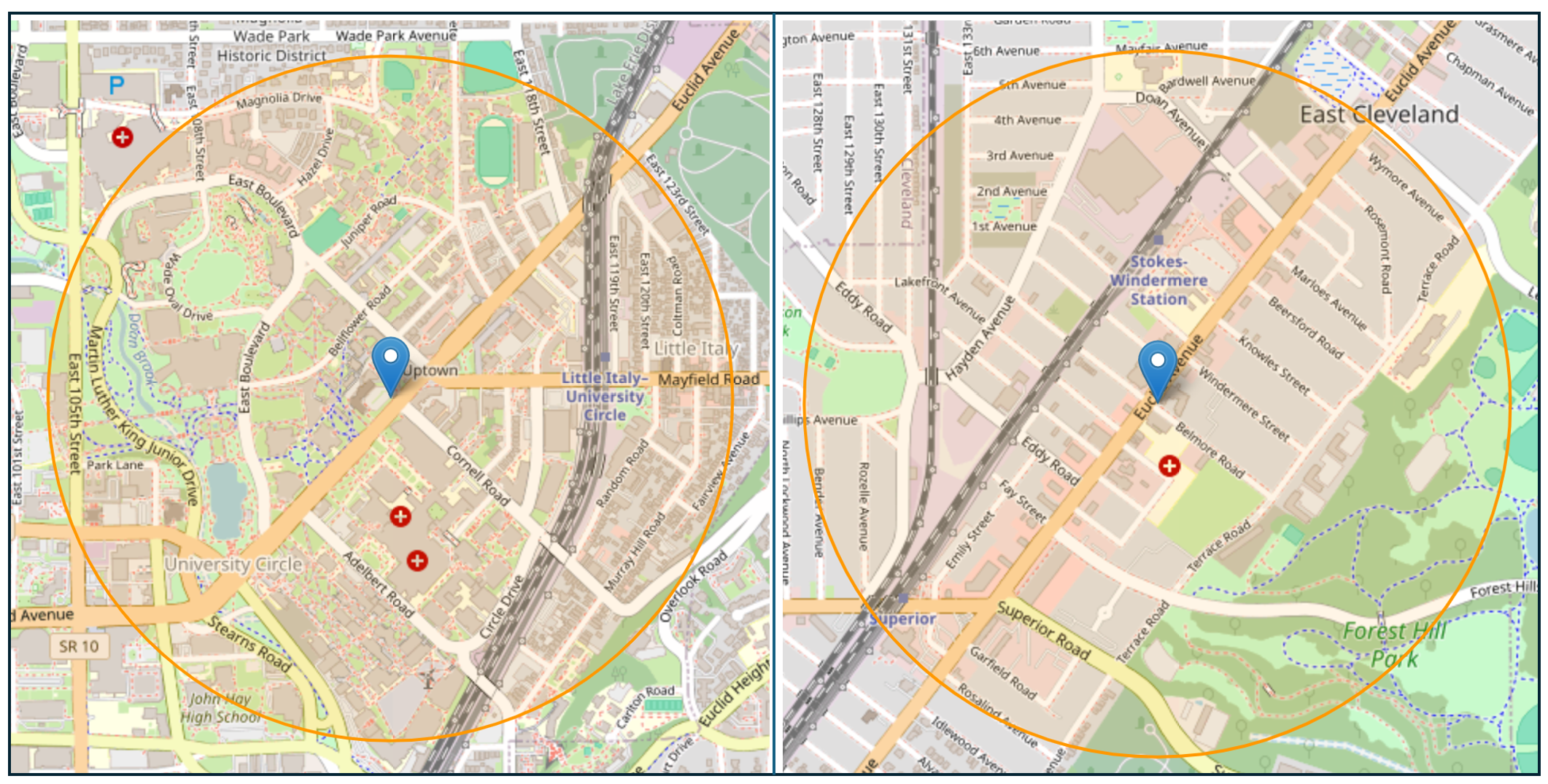
OpenStreetMap images of a ½ mile area of the Cornell and Belmore Station, Source: National Transit Station Atlas
My GBA data export confirms what is apparent to the naked eye. The Belmore Avenue station area has 110 buildings populated by OSM volunteer mappers, or slightly less than 13% of the total buildings. An additional 754 buildings are available through the Microsoft Building Footprints dataset, which was generated by training a computer vision model on satellite imagery. On the other hand, almost 96% of the buildings around the Cornell station are already included in OpenStreetMap. The table below shows a selection of Healthline BRT stations where the stations in red have 50% or fewer of their buildings labeled in OSM.
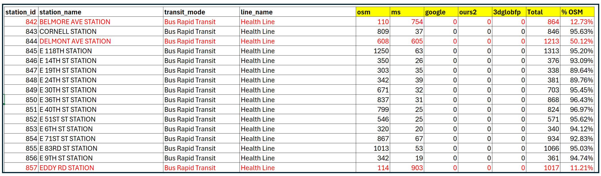
Excerpt of the GBA data extract for selected stations. Definitions of the column headings shown in yellow are: OSM = OpenStreetMap, ms =Microsoft Building Footprint, google =Google Open Buildings, ours2 = the custom dataset designed by the Technical University of Munich, 3dglopfp=an independent academically published building set from 2024.
In my visual scan, I considered a station area that looked like fewer than 50% of buildings were present to be “under-mapped.” The same standard applied to GBA data for all 5,115 stations in the Atlas identified 835 under-mapped stations, pretty close to my original count of 817 based on eyeballing the map. GBA identified 784,500 buildings in these areas not included in OSM and almost all of these additional buildings come from the Microsoft Building Footprint dataset.
I then added the missing buildings into my 3-D station area renderings for the 835 under-mapped stations identified previously. Fortunately, the GBA includes building footprints and dimensions from all of its data sources. However, while the GBA has more robust data than OSM on the number of physical structures, it doesn’t have information what a structure is used for. OSM, on the other hand contains tags for parking lots and parking garages, two land uses that are important when it comes to identifying development opportunities near transit stations. Instead of replacing my OSM 3-D renderings wholesale, I wrote code that fuses the data together, relying on OSM to render buildings, where they have been mapped, along with parking structures, and filling in the gaps with GBA 3-D renderings.
Here is a “before and after” example from the Rahway commuter rail station operated by New Jersey Transit. The image on the left shows structures tagged in OpenStreetMap, 452 buildings total, whereas the image on the right shows OSM data enhanced by the Microsoft Building Footprint data in the Global Building Atlas, 1664 buildings total and a much more complete picture of the built environment around the station.
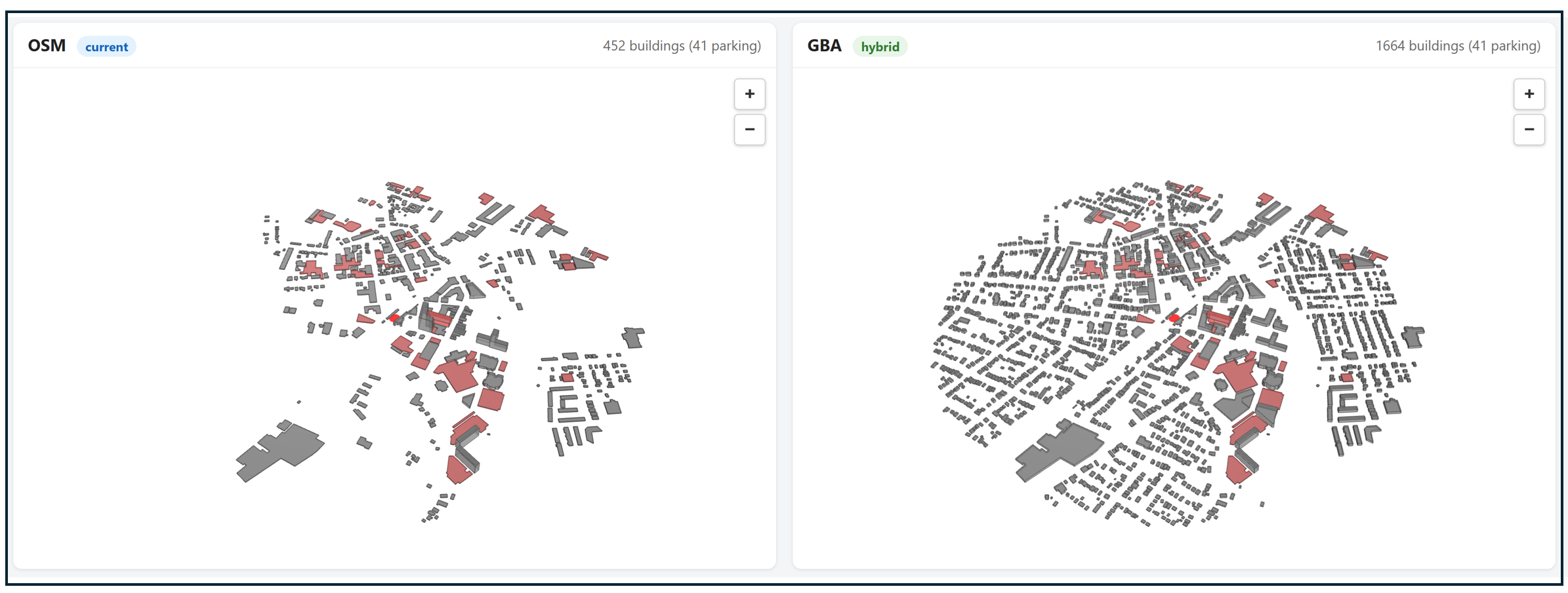
Renderings of the New Jersey Transit Rahway Station with OpenStreetMap only (left) and OpenStreetMap + additional data provided in the GBA (right).
In addition to enhancing the building data for under-mapped stations I precomputed this combined dataset once for every station rather than querying live each time a visitor loads the page. The live queries had been slow and occasionally unreliable, sometimes taking most of a minute or failing outright. The whole site is now both more complete and noticeably faster than it was before this project started.
What Height is the Right Height?
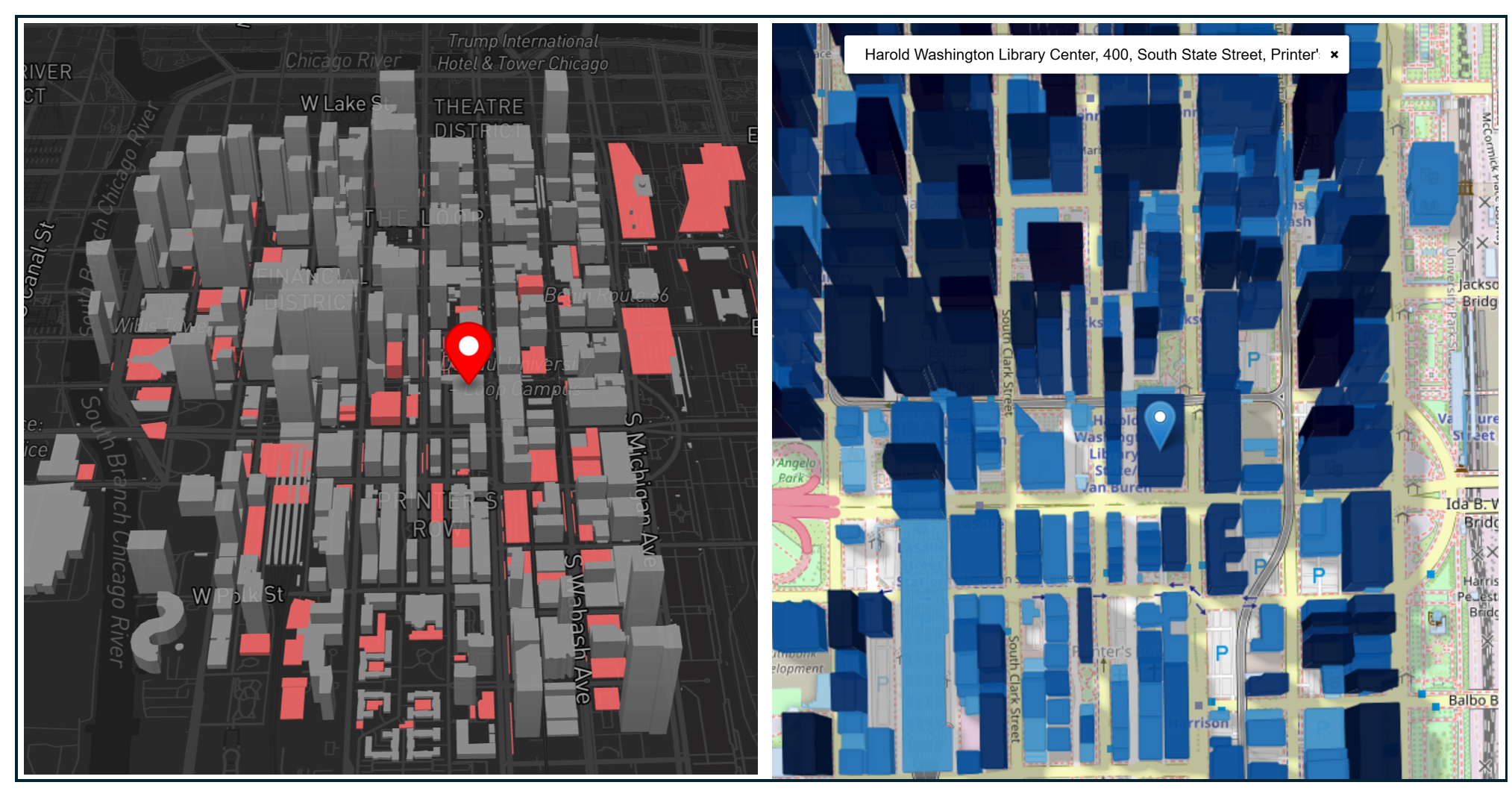
Left: A rendering of the Urban form in downtown Chicago around the Harold Washington Library Station using OSM building data (parking lots and garages shaded red). Right: Streets around the same station using GBA building height estimates (darker shades of blue = taller buildings). Sources: National Transit Station Atlas and Global Building Atlas
My parking-to-housing conversion tool proposes that new development not exceed the height of the tallest building within ½ mile of a station. That figure used to come entirely from OpenStreetMap, but OpenStreetMap's "tallest building" isn't necessarily a measurement of the tallest building that's there. It's the tallest building someone happened to tag. Where a station's building height data is thin, that reported figure could easily understate reality — there's no guarantee the untagged majority doesn't include something taller than anything that got measured. (My old fallback for stations with zero height-tagged buildings was blunter still: a flat two-story assumption, regardless of what was actually built there.)
The data bears this out clearly. Comparing OpenStreetMap's tagged height against GBA's satellite-derived estimate at all 5,115 stations, and grouping stations by how completely OSM tags height nearby, reveals two effects pulling in opposite directions:
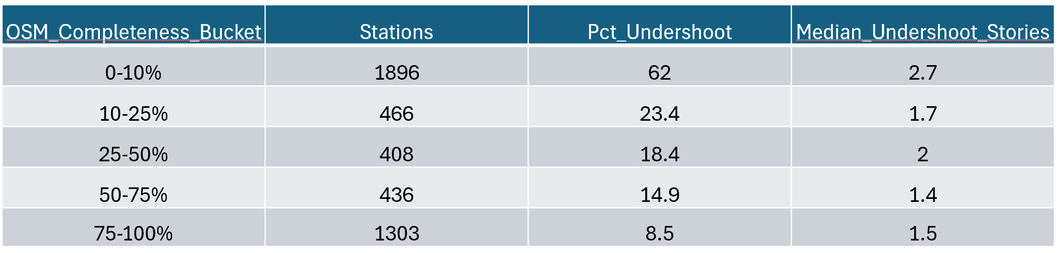
This table divides the National Transit Station Atlas stations into categories based on OSM height tagging completeness and identifies the number of stations where the tallest building tagged in OSM is shorter than the tallest building tagged in the GBA.
In sparsely tagged areas, OSM tends to miss taller buildings. At the 1,896 stations (37% of the Atlas) where 10% or less of nearby buildings carry any height tag, OSM's reported tallest building came in lower than GBA's estimate 62% of the time — and among those, the median miss was a real 2.7 stories, not a rounding error.
In well-tagged areas, OSM sometimes has the edge. Looking at all stations together, GBA's height estimates run roughly 6–16% lower than OSM's own tagged heights on average. And for the single tallest building near each station specifically, OSM reported the taller figure about 59% of the time — often by a wide margin, an average of 34 meters when it won, versus GBA's 14-meter average margin on the times it came out taller. My theory: nobody bothers tagging the height of an ordinary building, but a genuine landmark skyscraper has public documentation and real mapper interest behind it, so where OSM does have a number for a real standout building, it's often a good one.
OSM can be more precise at the specific buildings people cared enough to measure, but GBA is more complete — it never leaves a station with no answer at all. I chose completeness. A model that's occasionally a few percent low on a well-documented skyscraper is a smaller problem than a model that can be off by several stories at more than a third of all stations, with no way to know which ones without checking by hand.
A Higher Calling
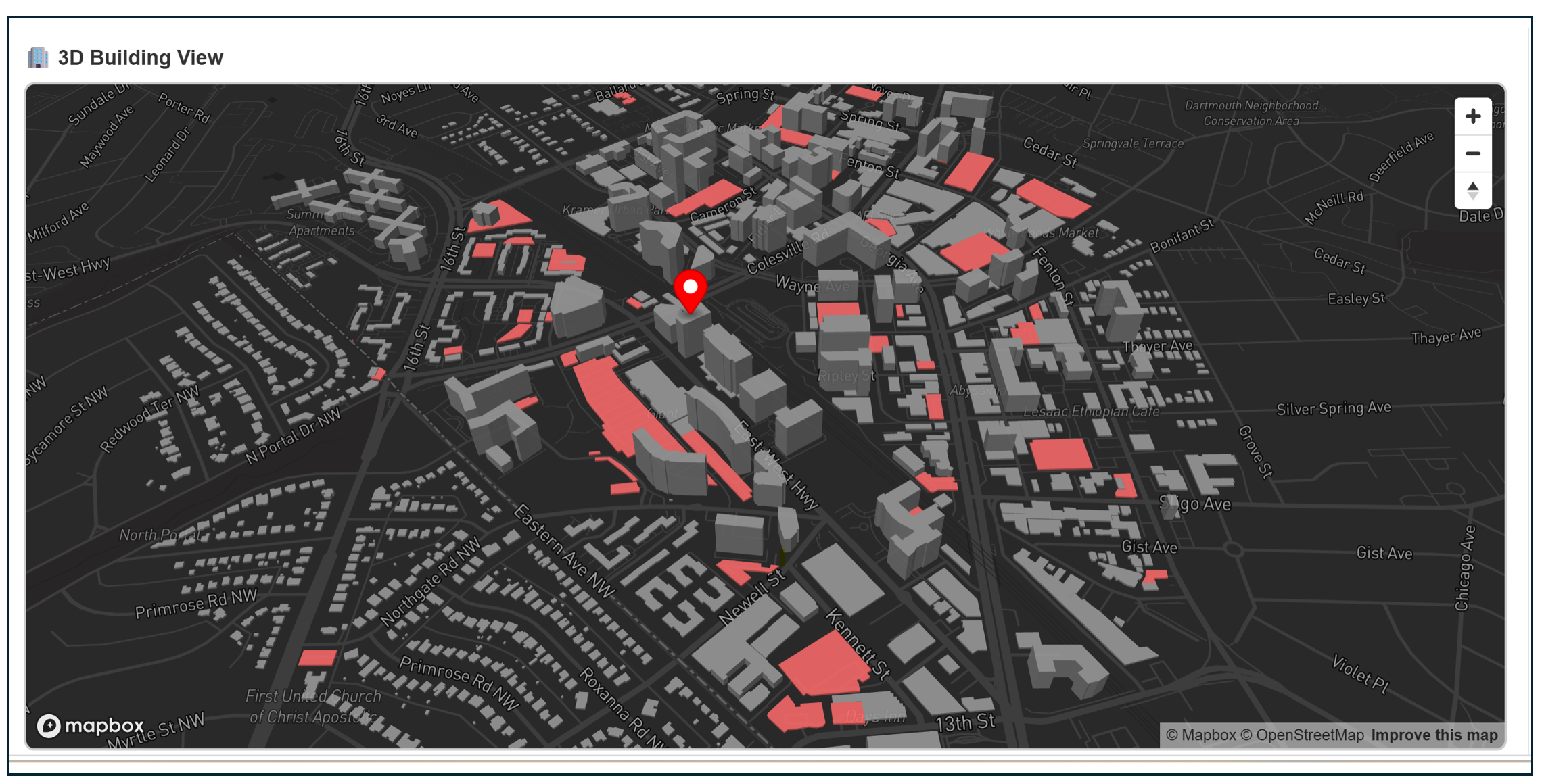
An excerpt of the 3-D built environment rendering of the WMATA Silver Spring Station area
I like to think that my new and improved housing conversion tool will help smart growth advocates make more persuasive cases for infill housing near transit. I like to think that good data in the right hands can lead to better places.
And I also believe that more complete and accurate data about our built environment is an end in itself, especially in these times when people in power are removing data from the public domain instead of adding to our collective knowledge.
Open data like the information available in OSM and the GBA along with data stewards like the Technical University of Munich, and Taylor Geospatial Labs contribute to a common understanding that enhances civil society. This data ultimately allows us to identify problems, allocate resources, measure progress, and be held accountable for results. Without reliable, publicly accessible national and even global data, decisions too often default to anecdote, ideology, and the interests of whoever has the loudest voice. People may not agree on what should be built near transit stations, or even how high the nearby buildings are, but we are all better off with a shared empirical foundation.
