Fatal Proximity: Pedestrian and Cyclist Deaths Near America's Transit Stations
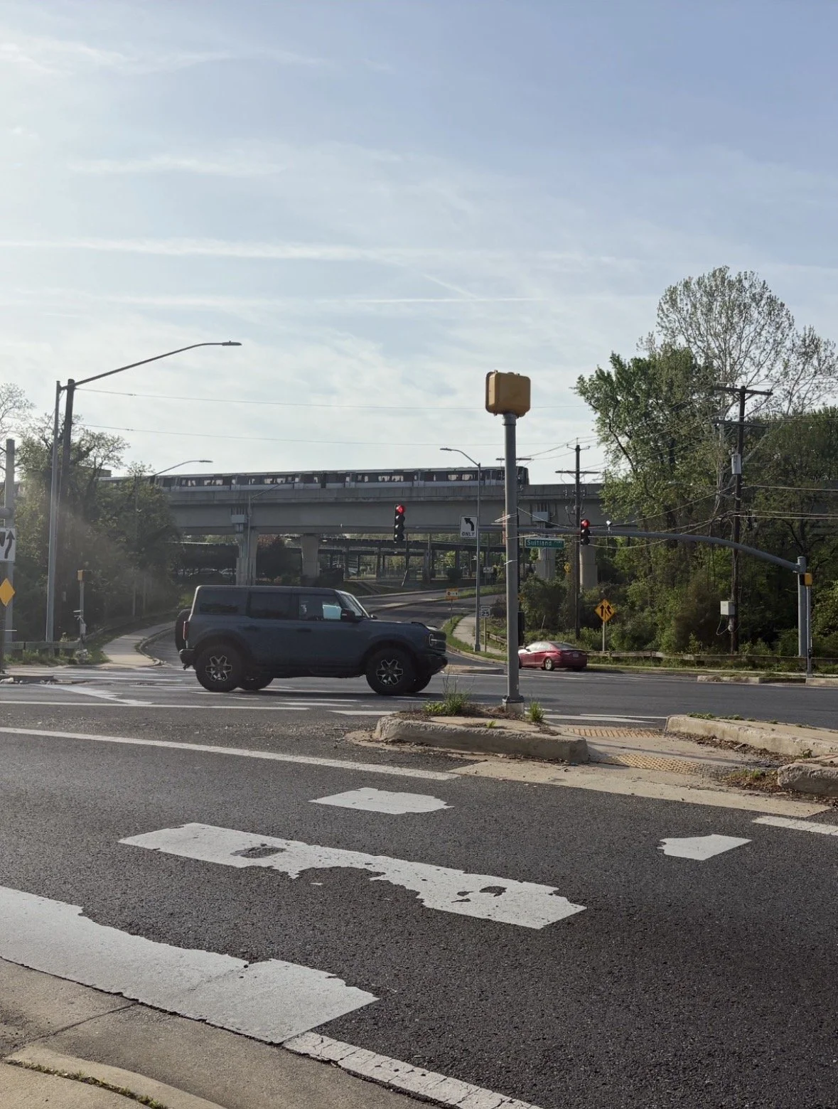
The intersection of Naylor Road and Suitland Parkway, a block away from the Naylor Road Metro Station, is one of the most lethal intersections for pedestrians in the United States. Image by the author.
For most of the late-20th century, the neighborhood surrounding Washington DC’s Navy Yard was an uninviting landscape of light industrial buildings and adult entertainment bisected by M Street SE, a six-lane high speed arterial designed to move traffic across town. WMATA opened a station at the Navy Yard in 1991 as part of the Green Line extension to Anacostia. It served Navy Workers and contractors but few others. Change began in earnest in the early 2000s when the U.S. Department of Transportation relocated its Headquarters to the corner of New Jersey Avenue and M Street, directly across from the station. In 2008, the Washington Nationals stadium opened a few blocks away. Soon new apartments, stores and restaurants had opened close to the Metro and thousands of people began crossing M Street each day, even as cars and trucks continued to speed down the road.
On April 29, 2010, Amy Polk, a 42-year-old US DOT contractor and mother of two young children was struck and killed by a garbage truck as she crossed M Street at First Street while using the crosswalk. A few months later, a second DOT worker was seriously injured by a dump truck while crossing M Street, prompting Secretary of Transportation Ray LaHood to meet with the DC police chief and District Department of Transportation to improve safety.
Secretary LaHood posted on his “Fast Lane” blog that he is "really, really worried about our employees' safety” and discussed safety countermeasures including "Extended crossing-guard hours; Stepped-up pedestrian and vehicle enforcement; Pedestrian training and education; speed trailers (the roadside digital signs that display a driver's speed) and prohibiting right turn on red,”
But LaHood also reminded readers that the "the quickest way I can think of to prevent more accidents like these is for employees and visitors walking to and from our building to, please, stay alert….Whether you're a pedestrian, a bicyclist, or a driver, having the right-of-way does not guarantee your safety."
There is something clarifying about a death that happens at the front door of the federal agency responsible for transportation safety. The problem was not that no one understood the risk. The experts were literally across the street. The problem was that understanding the risk and fixing it are two entirely different things. It calls attention to safety issues nationally, in particular the dangerous intersection of high-speed arterials, transit-oriented development, and vulnerable road users.
Roadway deaths anywhere are a tragedy and accidents that involve pedestrians and cyclists near transit stations are particularly concerning. Most transit stations attract people traveling to and from a station by foot or bicycle already exposing vulnerable road users to accidents. And as residential and commercial development around stations increases, as it did around the Navy Yard station, more and more may be in harm’s way. People working to build better places to live and work around America’s transit stations need to focus on ensuring these places are safe for everyone.
The Data Behind the Deaths
This post examines pedestrian and cyclist fatalities within ½ mile of transit stations in the United States in order to better understand the root causes and possible solutions. Readers can learn about fatalities around specific stations through the National Transit Station Atlas which maps the locations of fatalities and provides data for additional analytics.
Data on fatalities comes from the Fatality Analysis Reporting System (FARS). Operational since 1975, FARS contains data on a census of fatal motor vehicle traffic crashes within the 50 states, the District of Columbia, and Puerto Rico. To be included, a crash must involve a motor vehicle traveling on a trafficway customarily open to the public and must result in the death of a vehicle occupant or a nonoccupant within 30 days of the crash.
FARS data sources include police accident reports, state vehicle registration files, state driver license files, state highway department data, vital statistics data, death certificates, coroner/medical examiner reports, and emergency medical service reports. This data is reported by State analysts to the National Highway Traffic Safety Administration (NHTSA). NHTSA publishes an annual report file (ARF) typically between 12 and 18 months after the end of the latest calendar year. In April 2026, NHTSA published the ARF for 2024.
FARS does not include information on pedestrian and cyclists who were hospitalized or injured but not killed in a crash, nor does it contain information on near misses, so the number of people involved in car crashes is far higher than the totals examined here. Cities and states compile more comprehensive information on traffic accidents, but there is no national dataset documenting non-fatal impacts.
This analysis uses FARS data for the ten most recent years (2015-2024) and identifies fatalities near transit stations by associating the fatality and station coordinates and identifying fatalities within ½ mile of each station. When a fatality occurred within ½ mile of multiple stations, the analysis associates the fatality with the closest station.
What Do We Know About Pedestrian and Cyclist Fatalities Near Transit Stations
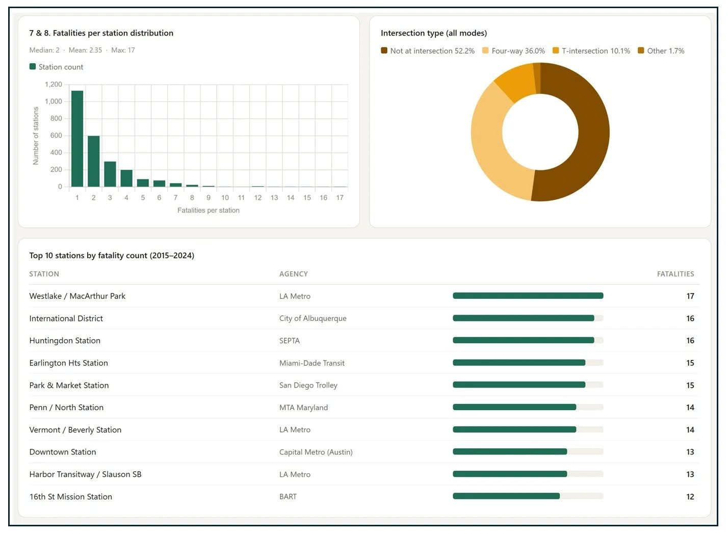
Almost 5,900 pedestrians and cyclists have been killed in motor vehicle crashes within ½ mile of a transit station from 2015 to 2024. Fatalities have occurred near almost half (49%) of the transit stations in the Atlas.
Year-over-year fatalities were relatively stable from 2015 to 2020 (ranging 516–573 per year), then climbed sharply starting in 2021, peaking at 709 in 2022 — a 37% increase from the 2017 trough. This pattern tracks the national pedestrian fatality surge that coincided with the pandemic period and its aftermath: changing travel patterns, increased speeding on emptier roads, and a behavioral shift that persisted post-pandemic. Fatalities in 2023–2024 are still higher relative to the pre-2020 baseline, though NHTSA's national estimates suggest modest improvement.
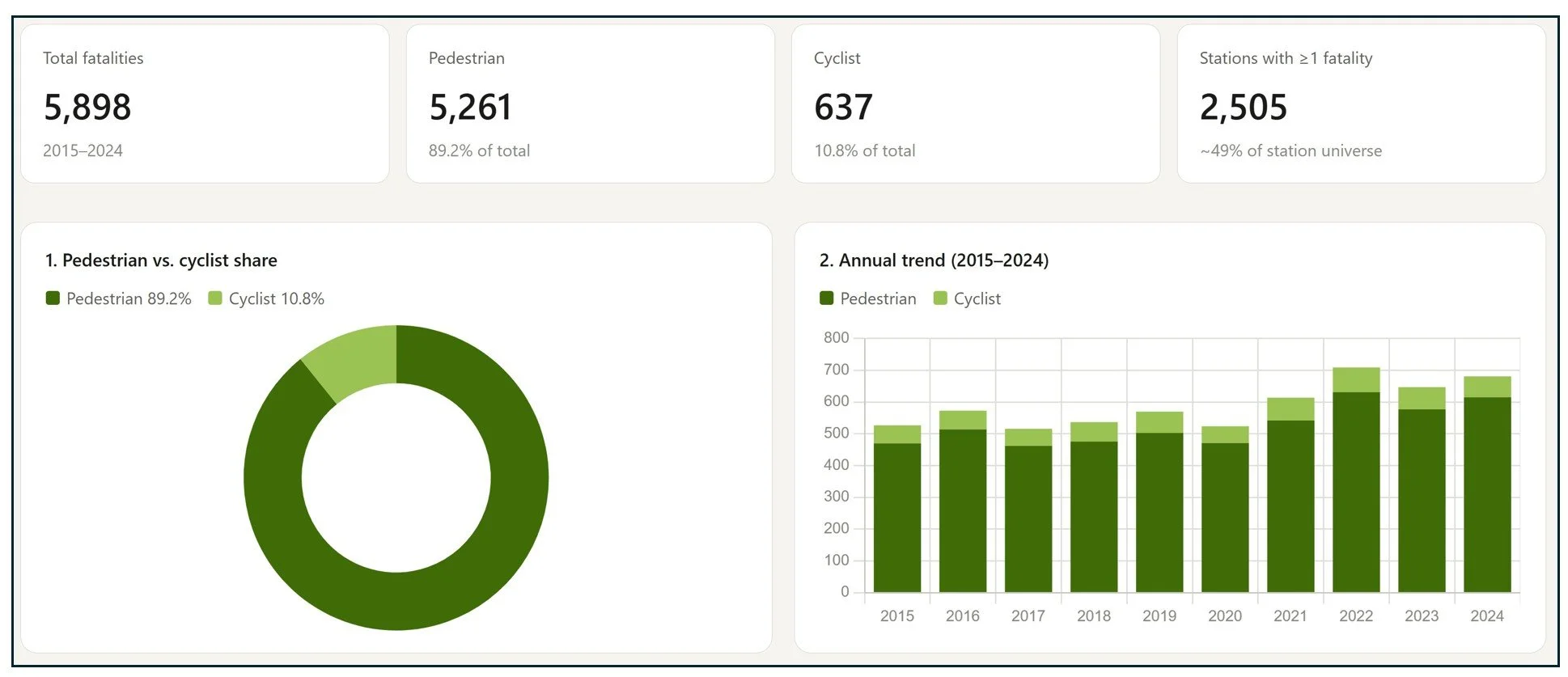
Most fatalities have occurred in the evening over overnight, including 1,210 deaths between 4 and 8 pm and 3,118 fatalities between 8 pm and 6 am. Night driving can increase crash risk as drivers and pedestrians/cyclists may be less alert, more impaired, and less visible. Evening and early morning drivers may also interact with increased pedestrian and cyclist activity around transit stations from the morning and evening commutes.
However, a night crash may not take place in pitch black. In fact, FARS recorded 3,164 fatalities occurring in "dark-lighted” conditions. Transit stations and their surrounding urban areas are typically lit by streetlights, but artificial lighting is not necessarily sufficient to prevent crashes. (In fact, in some circumstances it might produce glare or contrast issues for drivers. Specific crash records may have additional information on this factor).
FARS also identifies the type of road where a fatality occurred. Roadway categories include interstates (limited access, divided highways that are part of the interstate highway system), other freeways/expressways (limited access highways such as state highways that are not part of the interstate system), other principal arterials (major urban roads designed to carry high volumes of traffic through an area), and minor arterials (roads that carry fewer cars but still are designed for through traffic). Collector roads funnel traffic between arterials and local streets.
More pedestrians and cyclists lost their lives on principal arterials than any other roadway type (2,269 fatalities or 38.5% of all fatalities). When fatalities on minor arterials are included, more than half of all fatalities took place on multi-lane roads designed to move cars at high volumes and high speeds through an urban area.
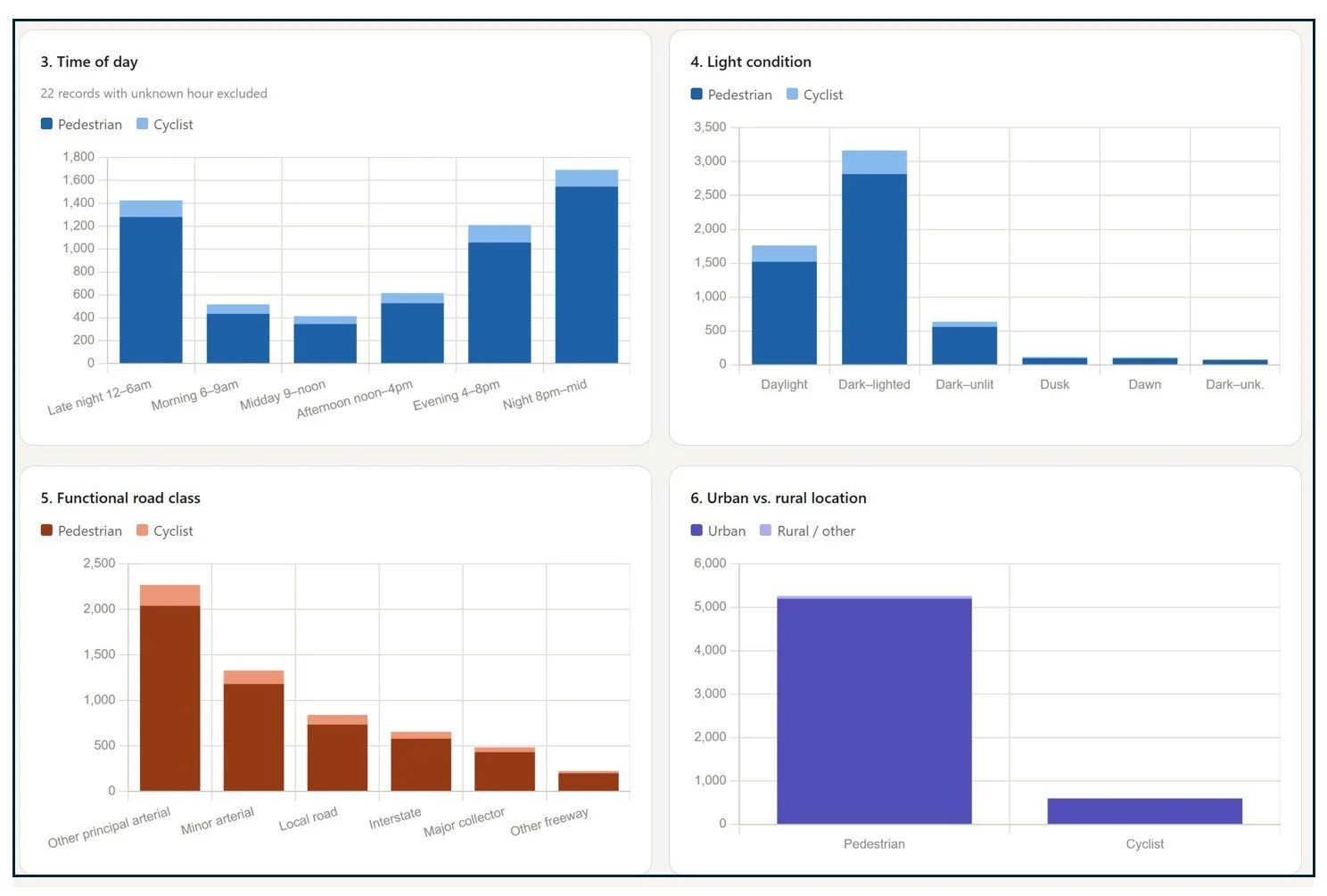
Just over half of pedestrians and cyclists (52%) were killed by drivers on a roadway but not at an intersection. This may include pedestrians walking along a roadway or attempting a “mid-block crossing” (crossing a road without using an intersection). Most of the remaining fatalities took place when pedestrians and cyclists were struck by cars at an intersection.
Fatalities around transit stations are rare, typically only 1-2 fatalities have taken place around a station over a ten-year period. However, seventeen station areas recorded ten or more fatalities. The question of why a small number of stations are associated with outsized pedestrian and cyclist fatalities deserves further scrutiny.
How Do Ped/Bike Fatalities Near Stations Compare to Ped/Bike Stations Elsewhere?
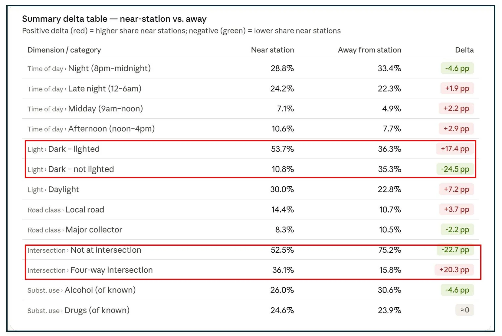
The 2015-2024 FARS data set records 75,448 pedestrian and cyclist fatalities on roadways throughout the United States. This includes the 5,898 fatalities that occurred within ½ mile of a transit station (7.8% of the total) and 69,590 deaths that happened elsewhere.
The transit station adjacent fatality data skews towards urban neighborhoods, whereas the data on fatalities away from stations includes deaths in rural and exurban areas as well as in cities without fixed guideway transit (or in a neighborhood further away from a station).
The table below compares fatalities near stations with fatalities elsewhere and shows signs of an urban/rural divide. A larger share of fatalities near stations took place in lighted areas. More fatalities that occurred away from stations took place not at an intersection whereas a greater share of station-adjacent fatalities took place at intersections. This makes sense insofar as urban areas are better lit and contain more intersections than suburban or rural roads.
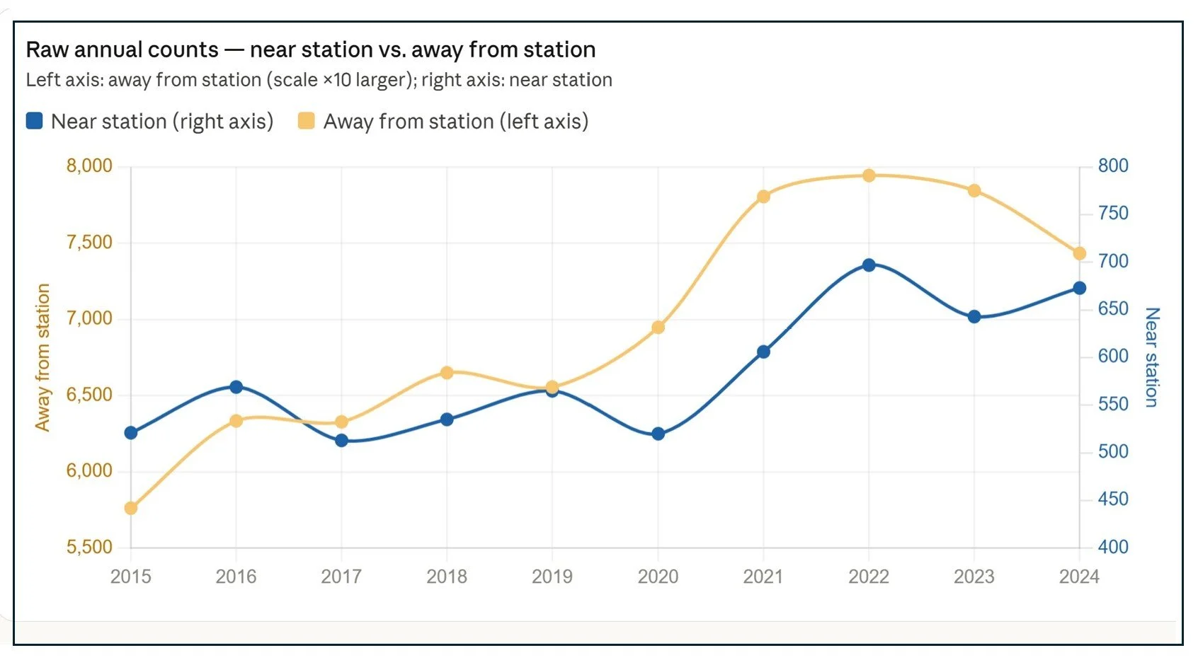
The overall number of pedestrians and cyclists killed between 2015 and 2024 has increased, but with some interesting differences between deaths near stations and those further away.
Non-station fatalities climbed steadily from 2015 onward, rising precipitously in 2020, mirroring the overall traffic safety crisis induced during the COVID-19 pandemic. However, beginning in 2022, fatalities occurring away from stations have remained relatively flat or have declined.
In contrast, station-adjacent fatalities dipped in 2020 but rose faster in 2021 and 2022 than non-station deaths. Since many transit stations serve the urban core, this year-over-year trend may reflect fewer pedestrians and drivers during the work-from-home phase of the pandemic, followed by more people and cars in urban areas as people returned to work.
What Explains the Odds that a Pedestrian or Cyclist has Been Killed Near a Transit Station?
The National Transit Station Atlas helps people better understand how the built environment around stations might contribute either to positive outcomes. such as transit ridership. or tragic ones, such as pedestrian and cyclist fatalities. To this end, I explored the impact on fatalities of six of the Atlas’ land use and transportation data features: 1. The presence of busy roads; 2. An area’s walkshed; 3. Intersection density; 4. Sidewalk coverage; 5. Bike lane coverage; and 6. Block length as well as the population residing near a station.
I built a logistic regression model using data on 5,116 transit stations across the United States. People use logistic regression to predict events that have binary (yes/no) outcomes. For example, imagine a doctor predicting whether a patient has a certain heart condition based on age, blood pressure, cholesterol, and exercise habits. Each factor gets a weight, some factors may be more predictive than others. But even a skilled doctor working from the same four factors will sometimes get it wrong — not because the factors don't matter, but because other things matter too: genetics, stress, diet, or simply bad luck. A model is only as good as the information it has access to.
In my model, each of seven built environment characteristics gets a weight reflecting how strongly it is associated with whether a station has had at least one fatal crash. Feed in a station's characteristics, and the model outputs a predicted probability: how likely, based on what surrounds it, is this station area to have been the site of a death?
The summary table below is worth sharing and explaining.
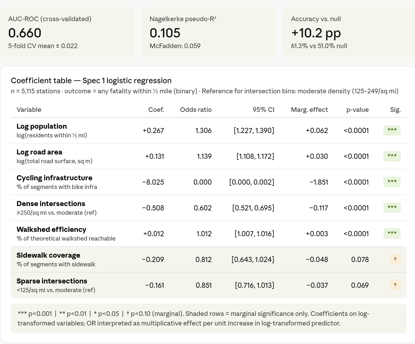
The AUC of 0.660 means the model correctly distinguishes a fatality station from a non-fatality station about 66% of the time — meaningfully better than a coin flip at 50%, but far from perfect. The pseudo-R² of 0.105 means the model accounts for roughly 10% of the variation in outcomes across stations. And the accuracy improvement of +10 percentage points over simply guessing "fatality" for every station reflects the real but limited predictive power of built environment data alone.
None of this is a failing of the analysis. It is an honest finding. The built environment shapes pedestrian safety. But pedestrian fatalities are also shaped by a driver's speed on a given night, whether a pedestrian was visible in dark conditions, whether a signal was timed to give adequate crossing time, whether or not a driver was distracted or impaired and dozens of other incident-level factors that no national station-level dataset can easily capture. The model identifies where structural risk is concentrated. What happens at any individual crossing, on any individual night, is a different and harder question.
Although the model has limited predictive power, it does provide meaningful insight into how each factor increases or mitigates fatality risk. The most intuitive way to read the summary table is through the odds ratio column.
The odds ratio column in the table answers a single question for each variable: by what factor do the odds of a fatality change as that characteristic increases? An odds ratio of 1.0 means no relationship. Above 1.0 means higher values raise the odds of a fatality. Below 1.0 means higher values lower the odds — and the further below 1.0, the stronger the protective effect.
For the two variables measured on very large scales — population and road area — the odds ratios are expressed per doubling. Every time the number of nearby residents doubles, the odds of a fatality increase by about 20%. Every time the hostile road surface area doubles, the odds increase by about 9%.
For intersection density, the comparison is between zones: stations in the densest street grid environments have 40% lower odds of a fatality than stations in moderate-density networks, all else equal.
Cycling infrastructure requires a word of explanation. The odds ratio shown in the table — effectively zero — represents a mathematical extreme: what would happen if a neighborhood went from no cycling infrastructure to having bike lanes on every single street. That scenario doesn't exist. A more realistic comparison: stations where 10% of streets have cycling infrastructure have 55% lower odds of a fatality than comparable stations with none. That is the largest protective effect of any variable in the model.
Two variables — sparse intersection density/block length and sidewalk coverage — are included in the table but are not discussed in detail. Both fell short of statistical significance once the other variables were controlled, suggesting their apparent effects are largely captured by stronger predictors already in the model.
Exposure Factor: Population Around a Station
My model uses 2020 Census block data on the number of people living within ½ mile of transit stations. This does not include stations that draw a significant non-residential population during certain times of day, such as stations in central business districts or near stadiums or other major attractions. Ideally, I would include data on actual pedestrian and bicycle traffic near stations and/or station boardings, but neither of these sources is available nationwide.
The images below from the Atlas show five station areas with increasing populations. The urban form near stations. ranging from single family detached housing to apartments is a loose proxy for station area population.
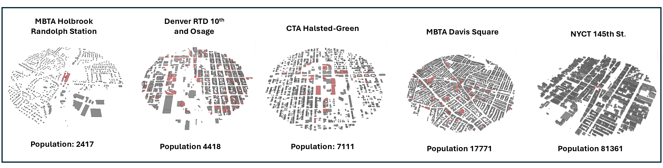
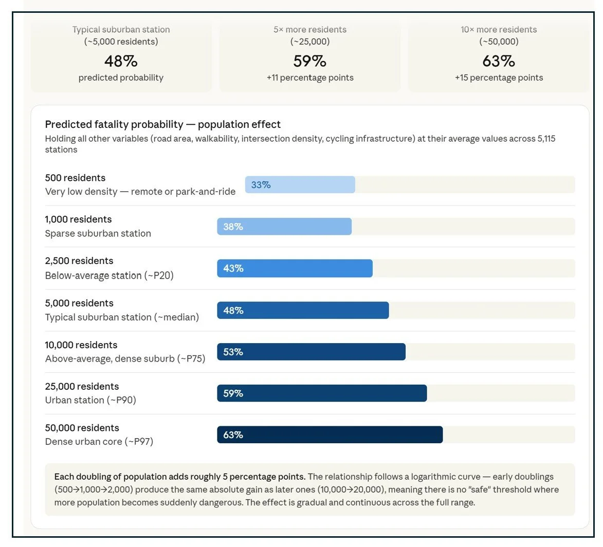
Denser, more populous station environments generate more pedestrian activity, which in turn creates more opportunities for fatal conflicts with vehicles. The model found that the more people who live within walking distance of a transit station, the more likely that station has been the site of one or more pedestrian or cyclist fatalities. Among a typical station — average road conditions, average walkability, average intersection density — the odds of a fatality climb steadily as population grows from 33% at very low-density stations (fewer than 500 residents nearby) to 63% at the densest urban stations (50,000+ residents). The observed data track the model almost exactly. But each doubling of population adds only about 5 percentage points — a real effect, but a gradual one, underscoring that population is an exposure factor, not a death sentence
The response to this finding should not necessarily be to limit new development or attempt to move people away from stations. Instead, planners and safety advocates should focus on stations surrounded by large numbers of people and whose populations have increased in recent years and/or are expecting to grow in the future with an eye towards what safety countermeasures exist or could be implemented to reduce the odds of a fatality.
Exposure Factor: Walkshed Efficiency
Imagine two stations: One includes a park-and-ride lot and is hemmed in by a freeway on one side and an industrial park on the other. People drive their cars to the lot and board the train but don’t walk or bike to destinations near the station. The second station is in the middle of a city neighborhood with streets fanning out in all directions. People can travel on foot or by bike along any street without encumbrance from natural or manmade barriers.
Each station has a theoretical walkshed, the distance that a person walking about 3 miles an hour could cover in fifteen minutes if they could walk as the crow flies in any direction, and an actual walkshed, the distance a person can cover when street networks and other barriers are taken into account. The images below from the Atlas below shows five stations with a range of actual walksheds compared to their theoretical maximum.
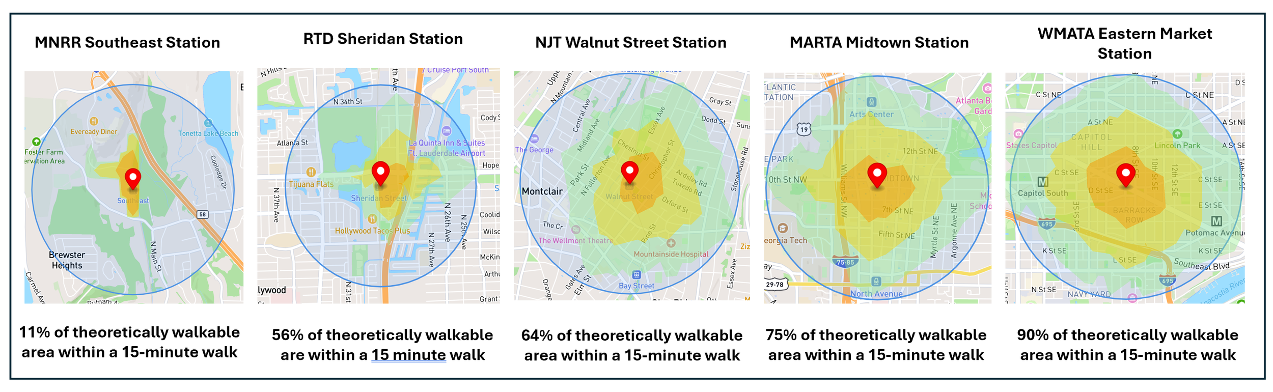
The light blue circle represents the theoretical maximum amount of land that could be covered within a 15-minute walk from the station. The orange, yellow, and green polygons represent actual walking area within 5, 10, and 15-mutes from the station.
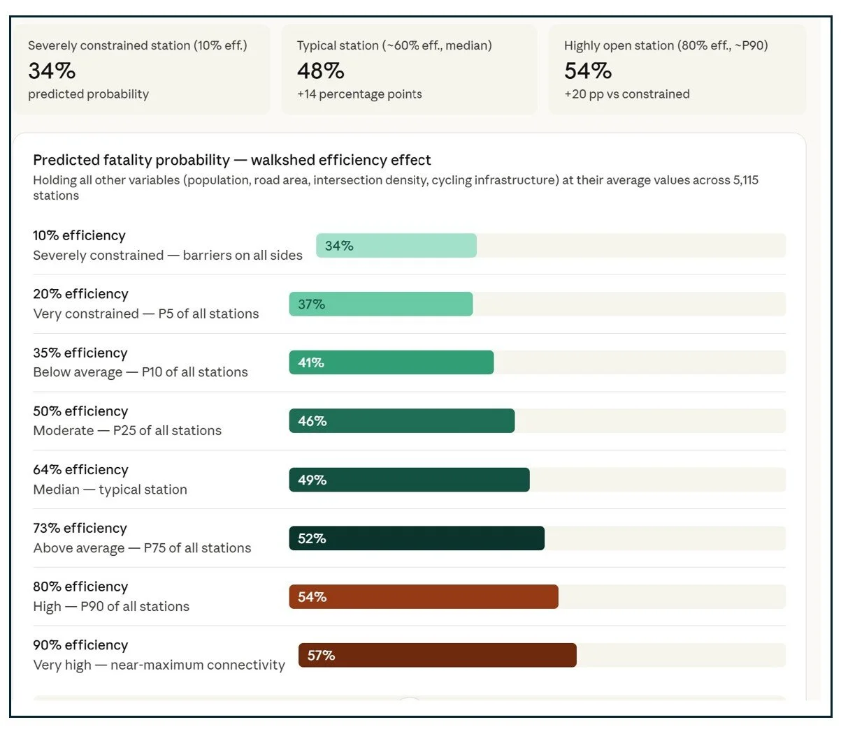
My model shows that the more freely pedestrians can move outward from a transit station in all directions — unobstructed by highways, rivers, railyards, or other barriers — the more likely that station has recorded a fatal crash. Among a typical station, the predicted fatality probability rises from 34% at severely constrained stations where barriers wall off most of the surrounding area, to 48% at the national median, to 54% at highly open, grid-connected stations. Every 10 percentage point increase in walkshed efficiency adds roughly 3 percentage points of fatality probability.
Just as depopulating a station area in order to reduce the risk of traffic deaths would be misguided, so too would be attempting to reduce walking opportunities in order to stem fatalities. If no one ever flew on an airplane or drove on a highway, fatalities in these areas would be zero, but so would mobility. And walking and cycling have benefits to human health and the environment. They are modes of travel we should be encouraging while finding ways for people to enjoy safely.
Station areas with large walksheds should be a priority for interventions, and planners should drill down on particular areas within a comprehensive walkshed to identify streets and intersections that are particularly dangerous and target countermeasures in these places.
Risk Factor: Hostile Infrastructure Around Stations
Fatal car crashes happen for many reasons, including poor visibility, distracted driving, and pedestrian and cyclist behavior. But a pedestrian hit by a driver who is on their cell phone while the car is going 15 miles an hour down a residential street is less likely to die than if they are struck by the same driver traveling 45 miles an hour down an arterial road.
My model applies data on the amount of land covered by highways and arterial roads within ½ mile of a station as a proxy for infrastructure that is hostile to pedestrians and cyclists. I collected data on the volume of hostile roads using a computer vision approach described here. The images below show stations with varying amounts of highways and or arterial roads nearby.
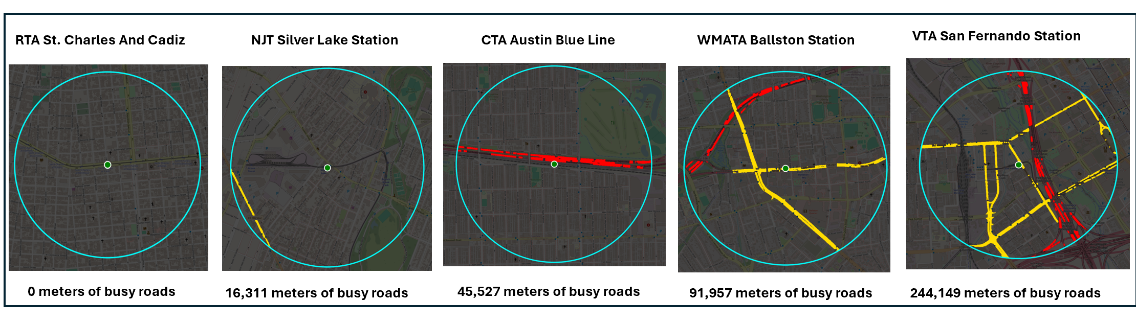
The areas shown in red represent divided, limited access highways and those shown in yellow represent arterial roads. Gaps in the imaging reflect street labels not included by computer vision in the roadway surface area count. As a result, the number of meters of busy roads identified is a conservative estimate.
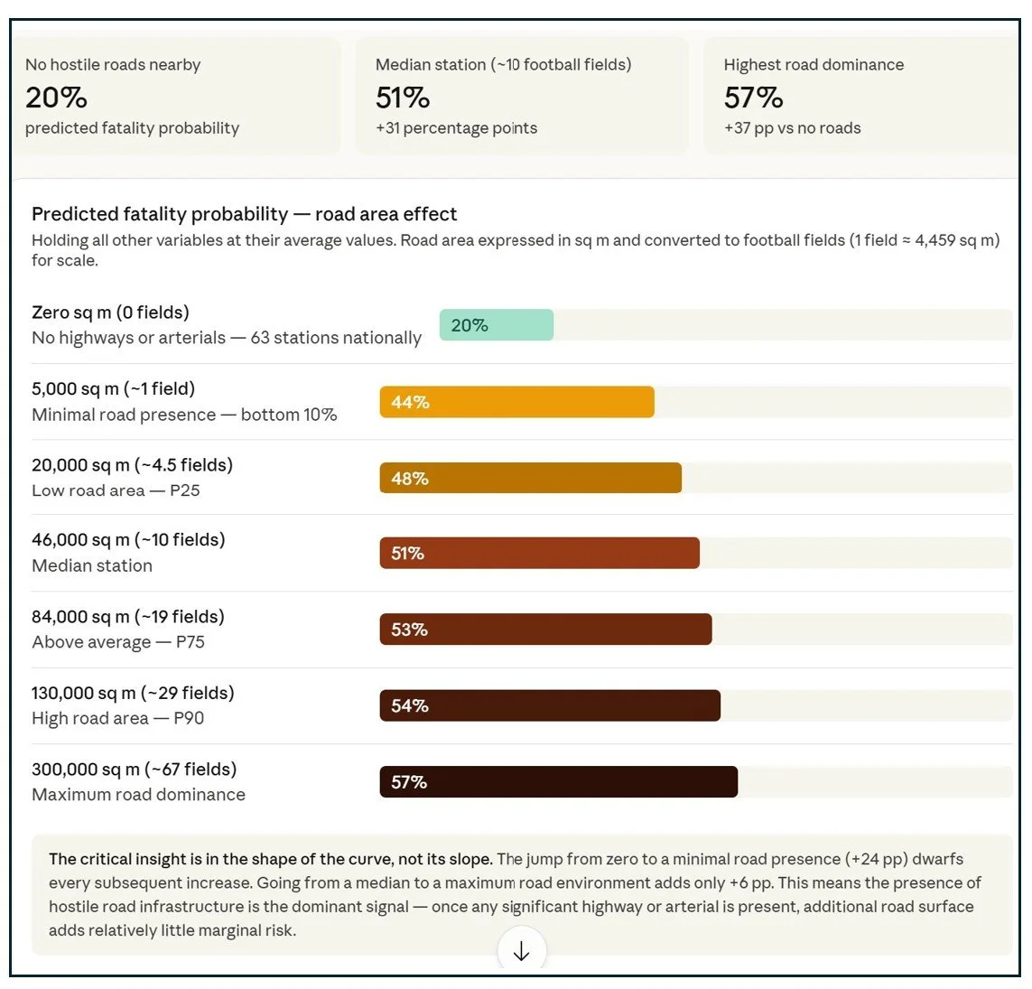
Of all the built environment factors in the model, the single most discriminating predictor of whether a transit station has experienced a fatal crash is the amount of land within a half-mile occupied by high-speed, high-volume roads — interstates, expressways, and principal arterials. The predicted fatality probability jumps from just 20% at stations with virtually no hostile road infrastructure to 51% at the median station and 57% at the most road-dominated environments. More than half — 53% — of all pedestrian and cyclist fatalities near transit stations in this dataset occurred on these high-speed road classes. And in the raw data, the presence of any highway in the station walkshed alone is associated with a 9 percentage point higher fatality rate.
The “take away” from these results seem obvious: planners and safety advocates should take a closer look at conditions for pedestrians and cyclists along highways arterial roads close to stations to identify additional risk factors and propose countermeasures. However, implementing interventions may be challenging as many of the busiest roads are also intercity corridors are managed by State departments of transportation, not local governments. A regional approach involving state officials, metropolitan planners, as well as local advocates may be necessary.
Risk Mitigation Factor: Dense Street Networks
We know that speed kills and we also know there are multiple ways to calm traffic. One way traffic slows is when drivers need to navigate neighborhoods with relatively short streets and multiple intersections. Having to stop frequently at three- or four-way intersections means drivers cannot build up the kind of speed that might result in a fatal pedestrian or cyclist collision.
The National Transit Station Atlas includes data on the number of street segments and intersections around transit stations, along with station area averages and the number of streets and intersections per square mile. The images below show station areas across the intersection density ranging from sparse to dense networks.
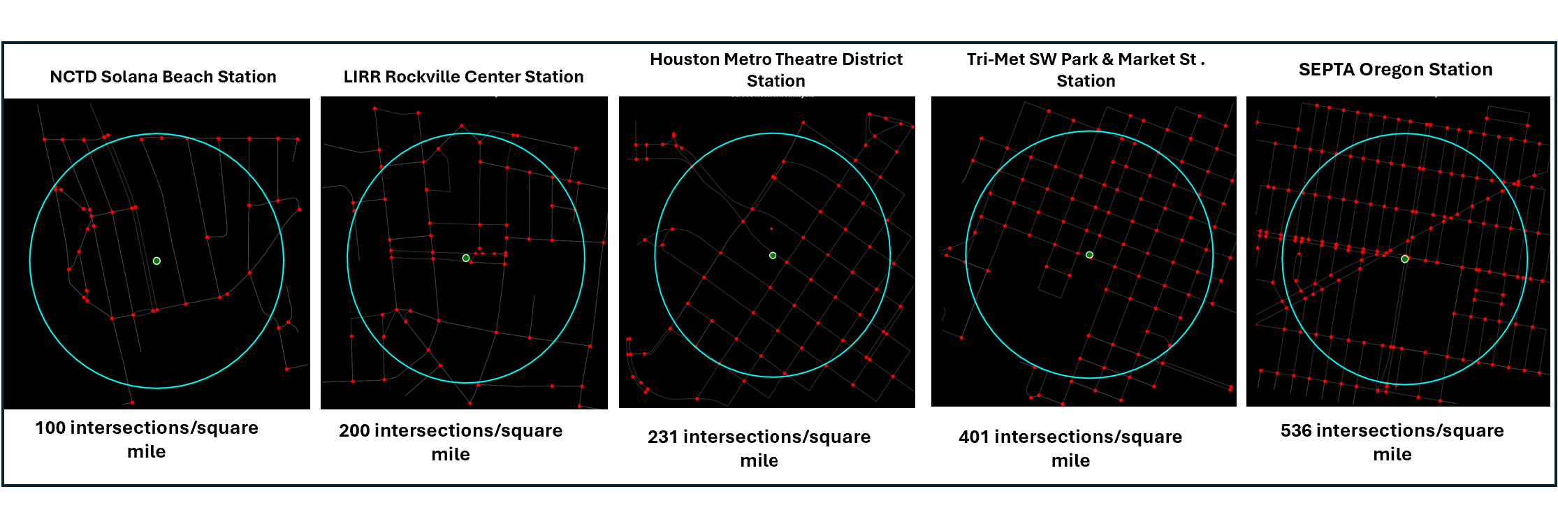
Red dots in the images above represent an intersection, defined as the place where two street segments are joined together.
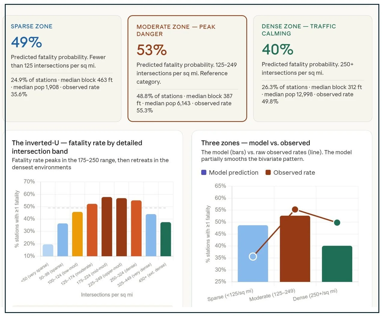
Street network density is the one factor in this model that cuts in both directions — and that makes it the most nuanced finding in the analysis. Stations surrounded by very sparse street networks record fewer fatalities, possibly because few people walk there. Stations embedded in the densest, finest-grained urban grids also record fewer fatalities, which may reflect a genuine traffic-calming effect. The danger zone, both in the raw data and in the model, is the middle: moderate-density networks with 125–250 intersections per square mile, where pedestrian activity may be high enough to generate exposure, but the street grid may not be fine enough to slow traffic. Dense grid environments have 40% lower odds of fatality than this moderate middle — the clearest safety signal in the network structure data.
Safety-conscious planners have few options when it comes to retrofitting a neighborhood street network. It is difficult, expensive, and contentious to reconfigure neighborhood streets to add intersections and reduce block length. However, developers planning “greenfield” TOD around stations that currently lack an established street grid could consider implementing a dense intersection network as a way to calm traffic and also expand options for pedestrians and cyclists to travel from place to place.
Risk Mitigation Factor: Bicycle Infrastructure
Over the past twenty years, many planners and advocates for safety and equity had advocated for a “complete streets” approach to transportation planning and design, a philosophy that prioritizes safety, accessibility, and mobility for all users—not just drivers. Complete Streets approaches integrate walking, cycling, transit, and driving as well as freight movement into a single network, while prioritizing safety, connectivity and accessibility.
While there is no one single method or data source that classifies streets as “complete” vs. “partially complete” or “incomplete” the presence of bicycle infrastructure on a roadway is an indication that planners encourage multiple modes of travel and are interested in offering protected spaces for bicyclists.
The National Transit Station atlas includes data on the number of street segments within ½ mile of a transit station and the number of these segments that include some form of bike infrastructure. This could include an exclusive bike lane (separated from mixed traffic) or a dedicated bike lane (a lane marked on a roadway for bicyclists) my data does not distinguish between the two. Bike infrastructure data comes from OpenStreetMap and is added by volunteer mappers, who may be more interested in providing complete data to some station areas than others. As a result, bike infrastructure data is likely underreported. However the existing data exhibits a range of bike infrastructure, as shown in the panel below.
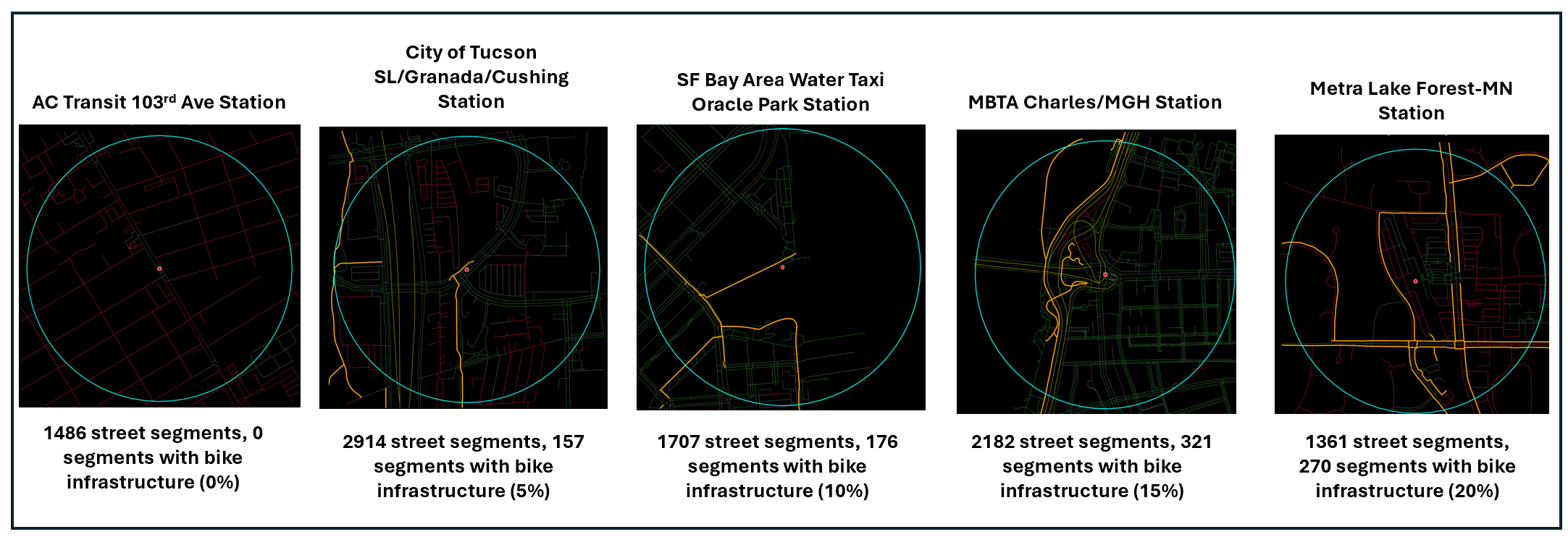
The yellow lines shown in this image represents bicycle infrastructure. Red lines represent streets without sidewalks and green lines represent streets with sidewalks. Additional methodology can be found on the National Transit Station Atlas “complete steets” page.
The model found that transit stations in neighborhoods with more cycling infrastructure are significantly less likely to have experienced a pedestrian or cyclist fatality over the past decade. Among a typical station — average population, average road conditions, average walkability — the predicted fatality probability drops from 53% at zero cycling infrastructure to 43% at 5% coverage and 33% at 10% coverage.
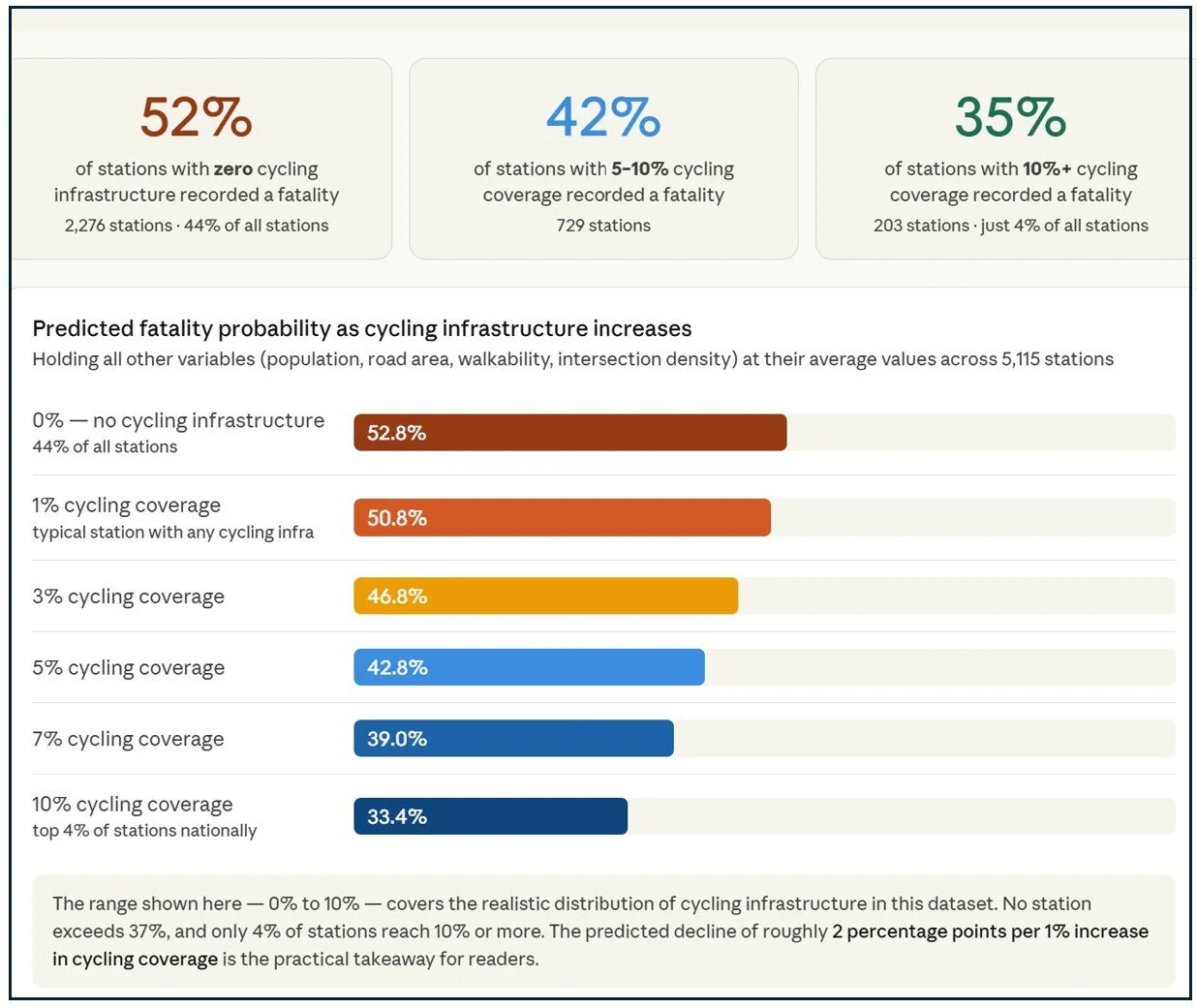
Adding a bike lane may prevent pedestrians or cyclists from being struck by cars and might also calm traffic by narrowing the amount of space cars travel or, more generally, be a marker of a broader safety investment culture. Places that build bike lanes may also have lower speed limits, better intersection design, and stronger traffic calming. Bike lanes may not be the optimal solution for every street or every station area, but there is plenty of room for improvement as 44% of stations in the United States have no bike infrastructure of any sort within ½ mile of the station. Even if this infrastructure is being undercounted, planners can learn from those jurisdictions who have successfully implemented bike lanes to take this important countermeasure.
A Closer Look at a More Complete Street
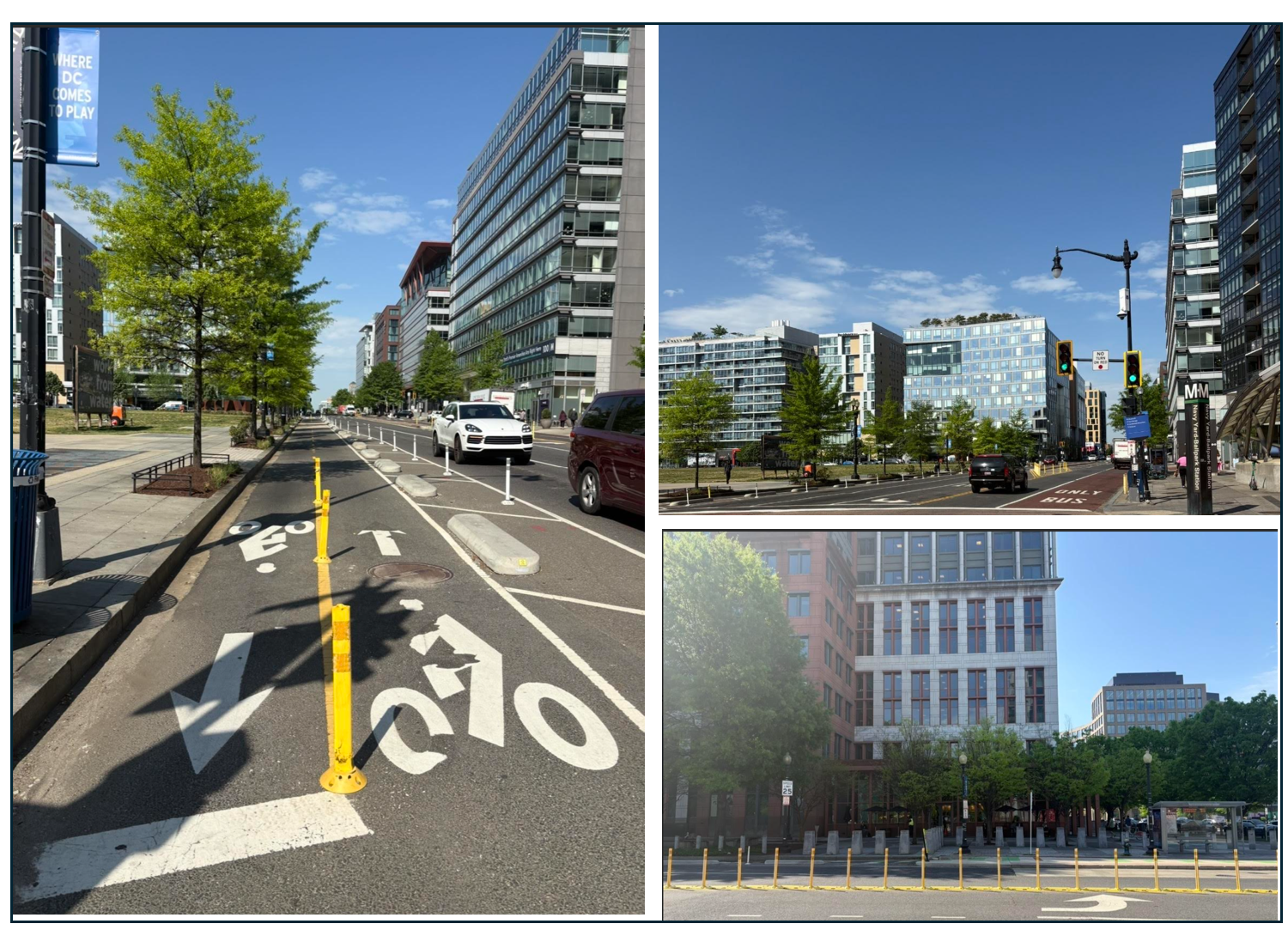
M Street looks and feels different now. In 2020, the District Department of Transportation installed bus lanes on the street as part of a pilot program to relieve crowding at bus stops during the COVID-19 pandemic. Shortly thereafter, DDOT provided funding under the Transportation Alternatives Program to the Capital Riverfront Business Improvement District to assess current conditions, engage with stakeholders, and envision a safer corridor. As a result, DDOT installed a two-way protected bike lane, shared bus and bike platforms, a bus stop island, and changes to the median to reduce vehicle conflict with pedestrians.
Opportunities to improve pedestrian safety are expanding nationally as well. In 2021, Congress created the Safe Streets and Roads for All grant program (SSR4A) part of the Infrastructure Investments and Jobs Act. SSR4A provides $5 billion over a five-year period to local communities for planning studies and project implementation designed to prevent roadway fatalities and serious injuries. In 2024, over 90% of the implementation supported pedestrian and bike safety projects. Other activities have included road diets (lane reductions), roundabouts instead of four way intersections, and street redesigns.
That progress is now at risk. Secretary Sean Duffy, who now occupies the same DOT headquarters on M Street where Amy Polk was killed, has announced changes to the SSR4A program. Applications that include dedicated bike lanes or infrastructure that reduces vehicle throughput will be given less favorable consideration. The practical effect is to narrow the toolkit available to the communities that need it most, and to shift the emphasis back toward the kinds of interventions Secretary LaHood was recommending sixteen years ago: crossing guard hours, enforcement campaigns, and reminders to pedestrians to stay alert. We have learned enough since Amy Polk died to know that telling people to be more careful is not the same as making the road safer
A Closer Look at a Dangerous Transit Station
Three stops southeast of the Navy Yard on the Green Line, the same forces that killed Amy Polk on M Street have been at work for a decade with far more frequent tragedy and far less effective response. From 2015-2024, twelve pedestrians have been killed within ½ mile of the station, including eight people at the intersection of Naylor Road and Suitland Parkway, making this station the eleventh most dangerous station out of 5,116 stations in my dataset (five other stations also have had twelve fatalities nearby).
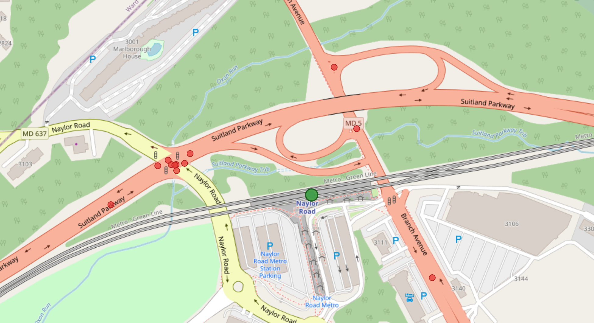
Excerpt from the National Transit Atlas showing the locations of 12 pedestrian fatalities near the Naylor Road station from 2015-2024.
My FARS dataset, which ends in 2024, does not yet include the tragic death of Khion Williams, aged 15. In February 2025, Khion was walking home from the Naylor Road Station in the crosswalk near the intersection of Suitland Parkway and Naylor Road. He was struck by one vehicle, and his body was thrown into another lane, where he was hit again by a second car.
I visited the Naylor Road Station on a warm, sunny weekday morning in April and crossed the Naylor Road and Suitland Parkway intersection to experience it for myself. Suitland Parkway is coded as a highway on OpenStreetMap, but unlike most limited access highways, there are no walls or other barriers preventing pedestrians from crossing the street. The morning I visited, it seemed like cars were going upwards of 60 miles an hour on the highway. Both Suitland Parkway and Naylor Road slope down as they approach the crossroads, allowing cars to accelerate through the intersection. An apartment building is located a few blocks south, putting the intersection on the most likely path of travel between people walking to the station. The only pedestrian safety feature is a walk button and a faded crosswalk.
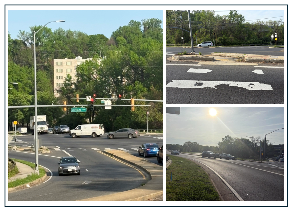
The intersection of Naylor Road and Suitland Parkway as seen from Naylor Road and the pedestrian crosswalk. Images by the author.
A Tale of Two Stations
The Naylor Road station area has seen two decades of planning studies and zero structural fixes. The Prince George's Planning Department commissioned a pedestrian safety study back in 2011. That study evaluated pedestrian and bicycle infrastructure and identified locations for low-cost, short-term improvements including pedestrian crossing improvements, signal timing changes, traffic calming measures, and new facilities. Those recommendations included specifically adding pedestrian access on the west side of the station near Suitland Parkway. The recommendations went largely unimplemented.
One reason improvements are so difficult is that this requires coordination across multiple levels of government. The National Park Service controls Suitland Parkway, while Prince George's County, Maryland SHA, and WMATA all have overlapping authority over different pieces of the surrounding environment.
The most recent, consequential development is an active National Park Service (NPS) planning process that launched publicly just weeks after Khion Williams was killed. On March 31, 2025, NPS announced it is planning a new 0.4-mile, 10-foot-wide multi-use path on the north side of Suitland Parkway, connecting the existing trail at the D.C. border to Naylor Road, which would make it safer and easier for pedestrians and cyclists to reach the Naylor Road Metro Station and nearby communities. The full Environmental Assessment, design, review, and construction pipeline typically runs several years under the most favorable conditions.
Unlike M Street and the Navy Yard, the Naylor Road Station is not supported by a Business Improvement District. It does not play host to influential staff and leaders from the United States or District of Columbia Departments of Transportation. The area around the Navy Yard Station is one of the most rapidly gentrifying areas in the region. The median household income is $159,000 and 64% of the residents are white. The Hillcrest Heights/Temple Hills communities around Naylor Road are a very different picture. Hillcrest Heights is 84% Black, with a median household income of roughly $77,000–$83,000 depending on the estimate and a poverty rate around 11%.
There has been one pedestrian death near the Navy Yard station and none on M Street over the past ten years. Near the Naylor Road station, people keep dying.
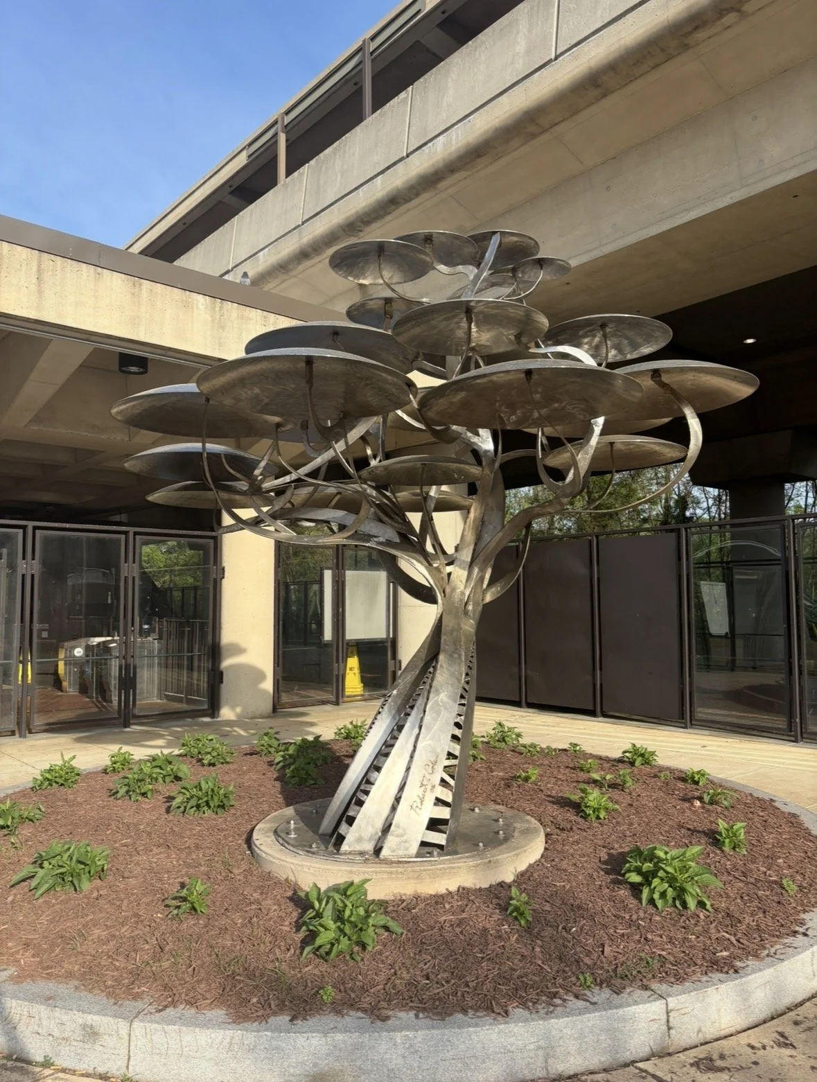
Heading back into the station, I passed by "Pod Trees," a stainless-steel sculpture by Robert Cole. I'm not sure if the sculpture has any specific meaning. Some people might see an alien mushroom tree. I see a cluster of umbrellas fanning out from the base — protection offered from above, to anyone standing underneath.
That is the promise transit makes. Come here. We built this for you. We will move you safely through the city.
But the promise ends at the fare gate. Beyond the platform, beyond the mezzanine, beyond the station entrance, the street is on its own terms. At Naylor Road and Suitland Parkway, those terms have been lethal. We have built a station that people cannot safely reach. We have extended the promise and then withdrawn it, precisely at the moment when the most vulnerable travelers — those without cars, without choices, without political weight — step off the curb.
Thirteen people have been killed within half a mile of this station in the past decade. And it is still raining.