How I Taught My Computer to Read a Map: A Computer Vision Approach to Identifying Hostile Infrastructure
When I was a boy, long before GPS became ubiquitous, my family went on road trips up and down the East Coast to visit our grandparents in New Jersey and North Carolina or for vacations in Maine. The glove compartment of our Volvo was stuffed with highway maps. Sometimes when I was board, sitting in the back seat, I would study the roadways, carefully unfolding the brittle paper and stretching out the map to its full size, about an arms-length. I would scrutinize the red, blue and black lines showing where we had gone and where we might go next.
As I moved around the country after collage, I’d fill my glove compartment with new maps of Ohio, Pennsylvania, and New Jersey. My sense of direction isn’t the best and it sometimes took me a while to get me where I wanted to go, but eventually, after pulling over a few times to scrutinize the map, I would reach my destination.
I still occassionally hit the highways for work or on vacation, but more often than not, I’m walking or biking to a Metro station for ordinary trips around Washington DC. When it comes to accessing transit, the busy roads that once fascinated me are more of an obstacle. For example, to get to the Silver Spring Metro, I need to cross Georgia Avenue, a six-lane road with heavy traffic, few crosswalks, and long wait times for a light. It can be gritty and noisy. I’ve seen pedestrians risk their lives when they get fed up with waiting for the light to turn and decide to jaywalk.
My unpleasant experience navigating busy streets to get to transit is not uncommon. Across the United States, we have invested billions of dollars into high frequency transit systems surrounded by roadways that make it difficult and unsafe to reach by foot or bike. When a station is built next to a freeway, it is impossible to travel to a station on foot at all, or to get there by the shortest route. Here are some examples from the National Transit Station Atlas’ Stations page.
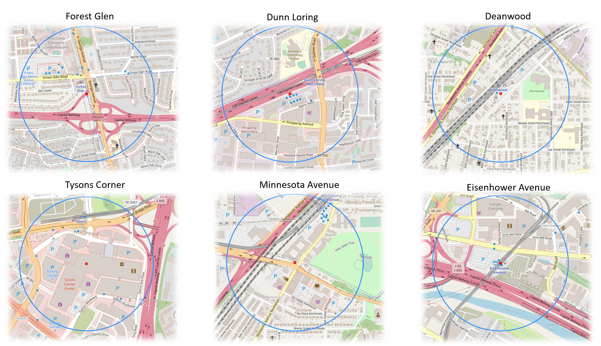
The above images show six of the 98 WMATA metro stations with circles representing a ¼ mile radius around the station.
Maps like the ones shown above don’t just help provide directions, they tell a story about the infrastructure choices we have made and the impact of our decisions. Sometimes these consequences are so ubiquitous that they become “hidden in plain sight.” My website, the National Transit Station Atlas helps users better understand their built environment and suggests places where infrastructure is hostile as well as helpful, so that communities can work towards positive change. Transit agencies can identify which stations face the most severe access barriers. Developers can understand land use conflicts around proposed transit-oriented development. Community advocates can document infrastructure inequities with data, not just anecdotes.
Measuring area, not just detecting presence, transforms the analysis from descriptive to policy-relevant. Saying "there's a motorway near this station" is obvious from looking at a map. But saying "15% of walkable land around this station is consumed by high-speed car infrastructure" quantifies a land use conflict that transit planners and developers can actually debate and address.
This blog posts describes my work to quantify and communicate roadway data around transit stations. I begin with my website’s core data tool: OpenStreetMap.
OpenStreetMap Maps the Roads
OpenStreetMap (OSM) is often called "the Wikipedia of maps" - it's a free, collaborative mapping project where volunteers worldwide contribute geographic data. Just as Wikipedia revolutionized encyclopedia-making by crowdsourcing knowledge, OpenStreetMap has created a detailed map of the world through community effort.
Most of the OpenStreetMap’s road data In the United States, came from a massive 2007-2008 import of TIGER (Topologically Integrated Geographic Encoding and Referencing) data from the U.S. Census Bureau. This public domain dataset included nearly 380 million road features covering the entire country - everything from Interstate highways to local neighborhood streets. The TIGER import kickstarted OpenStreetMap coverage in the US by providing a complete baseline road network. TIGER classified roads using codes into categories such as the ones below:
A1 - Limited-access highways with interchanges (Interstate highways) such as Interstate-95 or beltways around cities.
A2 - Major US highways and state routes, which tend to be high-capacity arterials
A3 - State and county highways connecting smaller towns.
OpenStreetMap takes these categories and incorporates their own tags which standardize geographic information. For example, the TIGER Files “A1” roads are tagged in OSM as “highway = motorway”, the “A2” roads are tagged as “highway = trunk” or “highway = primary” and the “A3” roads are tagged as “highway = primary” or “highway = secondary.”
Both the TIGER dataset and OpenStreetMap contain additional classifications for smaller roads, but my analysis focuses on motorways, trunk roads, and primary roads around transit stations. Compared to smaller, more local roads, these streets typically occupy the most land and generate the highest volume of cars operating at the highest speeds, potentially posing the greatest challenge to non-motorists traveling to and from stations.
Extracting Vector Data from OpenStreetMap
My initial approach to gathering roadway data was to query OpenStreetMap's database directly for road geometries and calculate their areas mathematically. I used the Overpass API to download vector data (actual road polylines) within an 800m radius of a station and calculate the area of each road based on its geometry and estimated width. But I ran into insurmountable challenges:
Missing width data: Most roads in OSM don't have width attributes. The database knows a road is a motorway, but often doesn't know if it's 3 lanes or 6 lanes wide.
Width estimation is inconsistent: I tried using default widths by road type (e.g., "assume motorways are 30m wide"), but this varied wildly. A rural two-lane motorway and an urban eight-lane freeway are both tagged as highway=motorway, but have vastly different footprints.
Rendering complexity: When I tried to calculate and visualize road areas from polylines, I struggled with overlapping roads, complex interchanges, and ensuring accurate area calculations from line geometries.
The buffer problem: Converting a line to an area requires buffering it by some width, but this creates incorrect overlaps at intersections and doesn't handle varying lane counts along a route.
After wrestling with these issues, I realized something counterintuitive: the rendered map already solves all these problems. OSM Carto's rendering engine has sophisticated logic for drawing roads at appropriate widths, handling overlaps, managing interchanges, and displaying them accurately. By analyzing the rendered output rather than the source data, I was essentially letting OSM's rendering logic do the hard work of determining actual road widths and areas.
The Magic of OSM Carto: Consistent Colors Everywhere
OpenStreetMap uses a standard rendering style called "OSM Carto" (short for cartography) to convert those database tags into the visual maps you see.
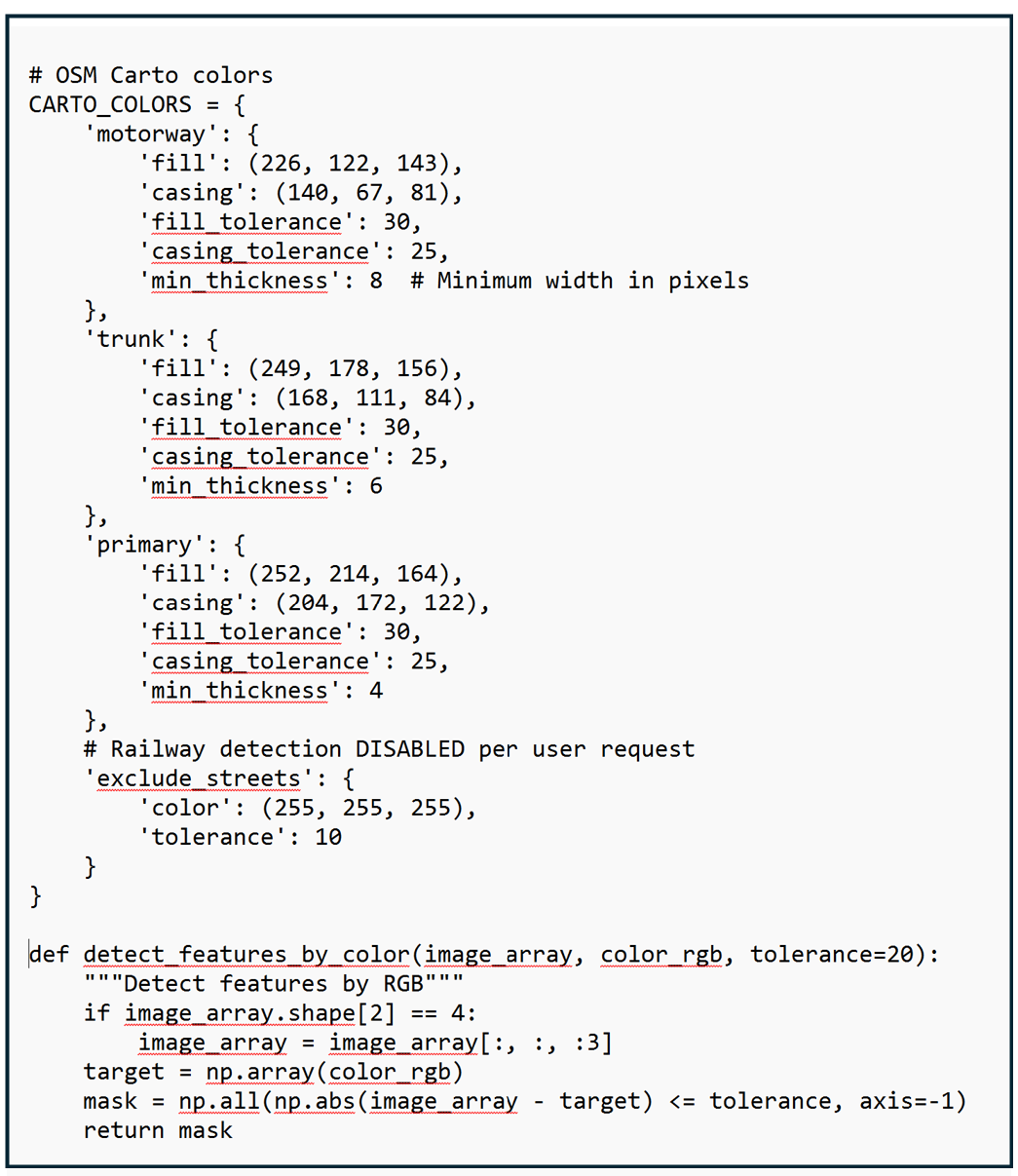
OSM Carto is like a stylesheet that says: "Every time you see highway=motorway in the database, paint that road pinkish-orange (RGB: 226, 122, 143). Every time you see highway=trunk, paint it peachy-orange (RGB: 249, 178, 156)."
Every color on a digital screen is made by mixing three colors - Red, Green, and Blue - at different intensities. Each color channel uses a scale from 0 to 255, where 0 means "none of that color" and 255 means "maximum intensity." So when I say a motorway is RGB (226, 122, 143), that means:
Red: 226 out of 255 (very high - lots of red)
Green: 122 out of 255 (medium - moderate green)
Blue: 143 out of 255 (medium-high - some blue)
Mix those together and you get that distinctive pinkish-orange color. This same RGB system is how computers define every color you see on screen.
This OSM color scheme is consistent worldwide. Whether you're looking at a motorway in Washington DC, London, Tokyo, or Sydney, it appears in the exact same pinkish-orange color. The rendering engine doesn't care about local road names or geography - it only cares about the tag.
Here's how OpenStreetMap renders different road types:
Motorways/Freeways (highway=motorway): Pinkish-orange (RGB: 226, 122, 143)
Trunk Roads (highway=trunk): Peachy-orange (RGB: 249, 178, 156)
Primary Roads (highway=primary): Butter-yellow (RGB: 252, 214, 164)
The image below shows a portion of the OSM Carto Key with roadway colors, descriptions and tags:
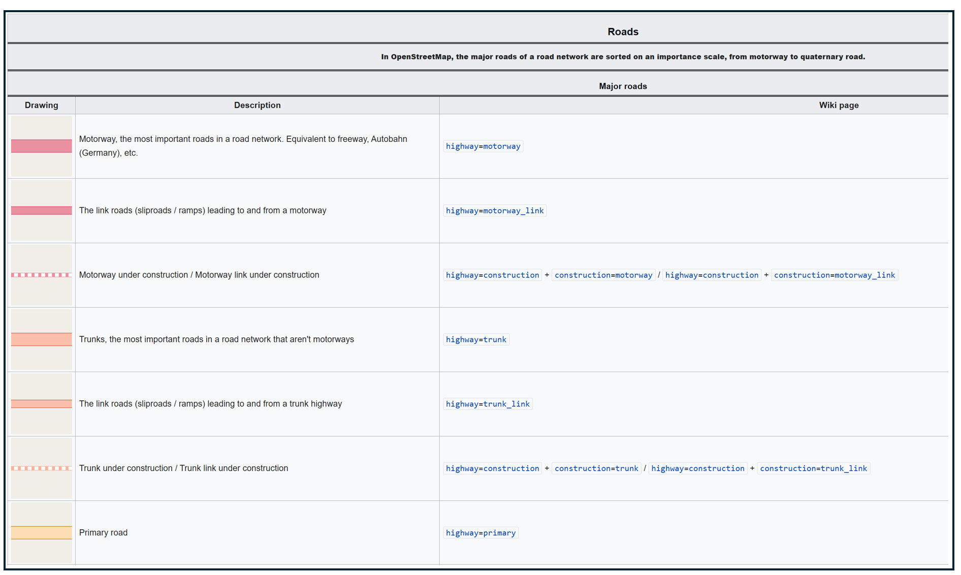
OpenStreetMap Carto/Lines - OpenStreetMap Wiki
This standardized rendering is what makes my computer vision possible. Because I know that every single motorway in every single city will be rendered in the exact same color, I can write code once that works everywhere. I don't need different color detection rules for New York versus San Francisco versus Chicago - the same RGB values work globally.
Step 1: From Station Coordinates to Map Tiles
My first code block brings in some utilities that will help translate the geographic coordinates of my transit stations to data that OpenStreetMap can work with.
OpenStreetMap's rendering system (OSM Carto) divides the world into a grid of "tiles" - small 256×256 pixel images. At zoom level 16 (which I use for this analysis), each tile covers about 610 meters × 610 meters.
We think about locations using latitude and longitude (i.e. "the WMATA Metro Center station is at 38.9072°N, 77.0369°W"), while OpenStreetMap's filing system uses tile numbers (like "tile X=9371, Y=12536 at zoom level 16"). These helper functions handle that translation.
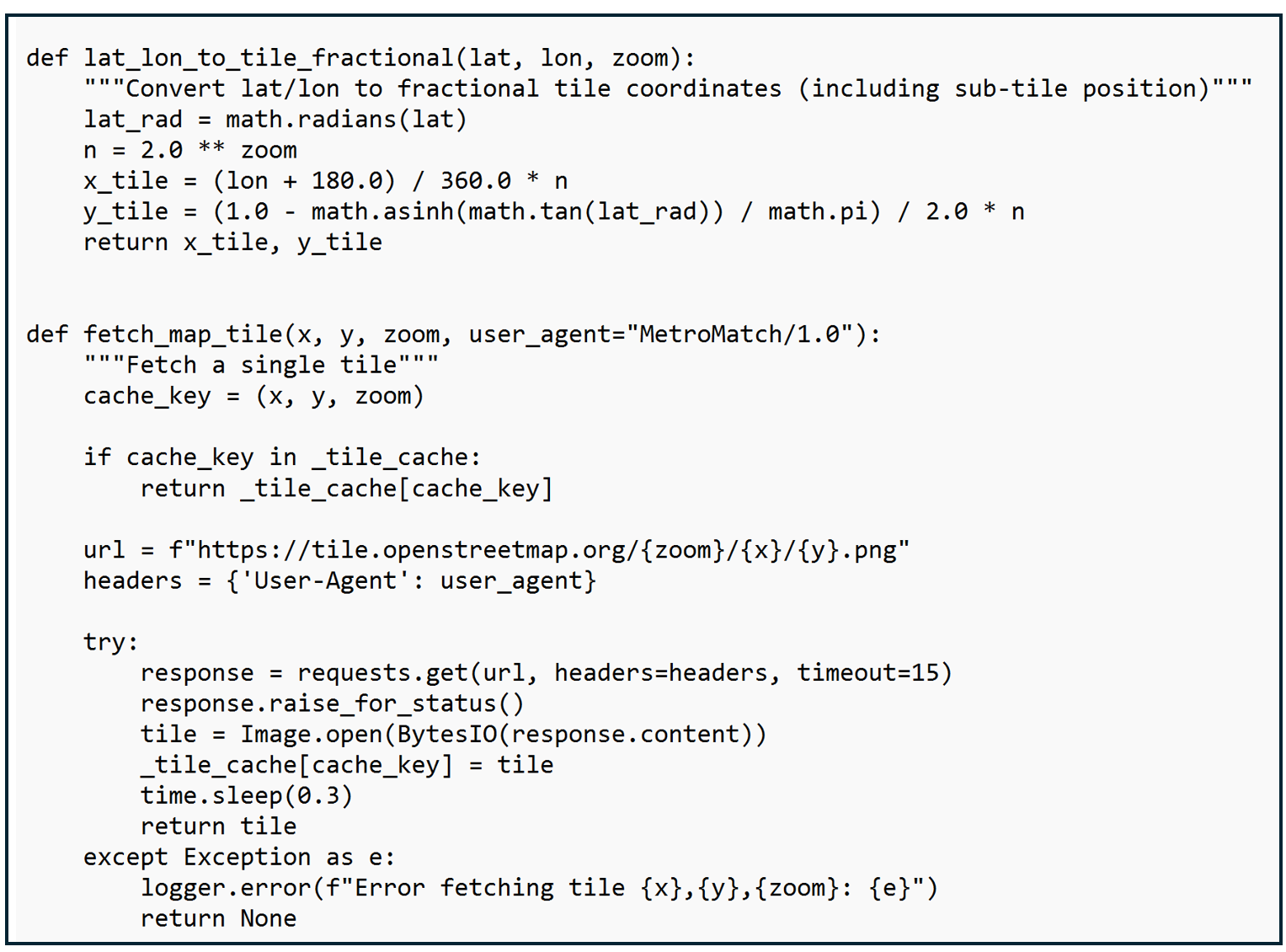
This code sets up the process for converting latitude/longitude coordinates to map tiles, including not only which tile a coordinate is in but where within the tile the coordinate lies. I also include code for checking to see if a tile has already been downloaded, to pause between requests so as not to overload the OpenStreetMap server, and to handle problems gracefully by logging an error rather than crashing.
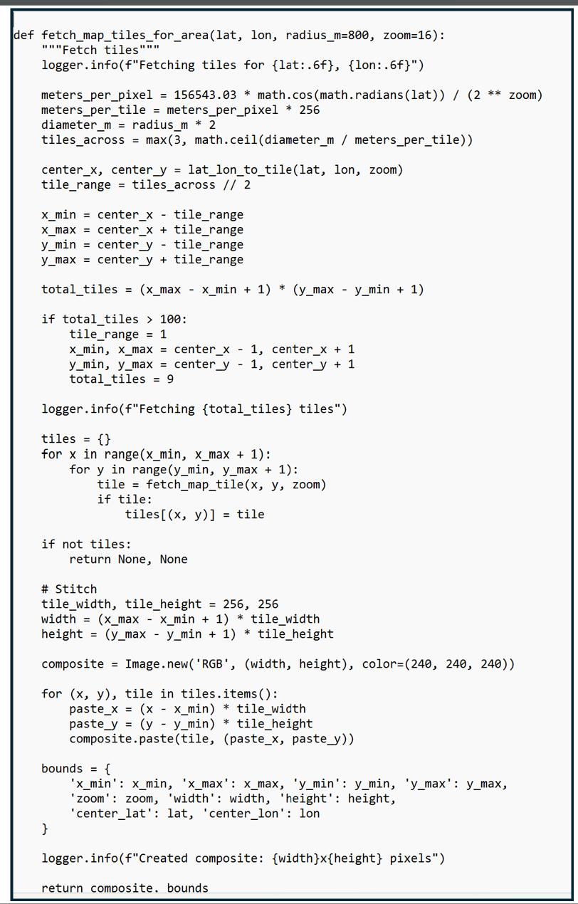
Step 2: Assembling the Map
Before we can detect and classify roadways, we need to build a complete map of the station area. Think of OpenStreetMap as a giant library of map tiles, like puzzle pieces stored on shelves. This function figures out which puzzle pieces we need for an 800-meter radius around the station (roughly a 15-minute walk), downloads them from OpenStreetMap's servers, then stitches them together into one seamless image. The result is a detailed map showing every street, building, and feature within walking distance of the station - ready for our barrier detection analysis.
The code shown below starts by identifying the real-world distance each tile needs to cover which depends on the zoom level and the latitude (tiles near the equator cover more ground than tiles near the poles because the earth is round). The code determines how many tiles are needed and loops through each tile position and collects each of the downloaded tiles into a dictionary. It then stiches the tiles together into one composite map.
Step 3: The Color Detective: Finding Roads by their RGB Values
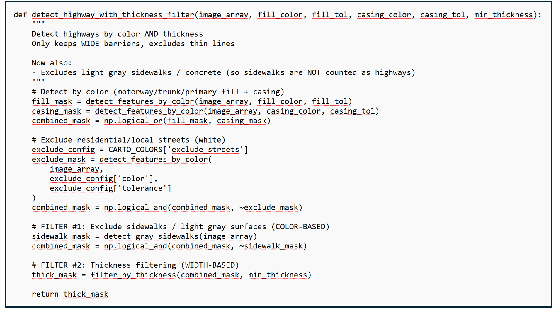
Once I identified the RGB values of the three types of roads, I stored these exact color specifications in a reference dictionary along with an acceptable color tolerance (to account for rendering variations). The color detection function then uses this reference guide to scan through the map tiles pixel-by-pixel, examining each individual-colored dot to determine what it represents and creating "masks" that highlight where each type of barrier appears. It's like using color-coded highlighters on a paper map, except the computer can do it instantly across thousands of pixels and measure the results precisely.
This code shown below uses a color reference guide to identify any pixel with an RGB value associated with motorways, primary roads, and trunk roads. It also applies a thickness criteria to different types of roads for reasons which I will explain later.
Understanding Pixel Resolution: How Big is a Pixel, Anyway?
A pixel is a single colored dot - the smallest building block of a digital image. At zoom level 16 (which I use for this analysis), the size of each pixel depends on latitude due to the Web Mercator projection that OSM uses. Pixel sizes get smaller as you move north and south away from the equator. At the equator, each pixel represents 2.39 meters × 2.39 meters. That's about 5.7 m² (61 square feet) - roughly the size of a small bathroom. At Washington DC's latitude (38.9°), each pixel represents 1.86 meters × 1.86 meters. That's about 3.5 m² (37 square feet) - roughly the size of a king-size bed. So when I analyze a transit station in Seattle, I'm examining about 775,000 pixels, but for a station in Miami, only 435,000 pixels - even though both circles cover the same physical area on the ground.
You might be thinking: "This code examines hundreds of thousands of pixels per station, comparing RGB values, applying thickness filters, and counting areas... how long does that take?" The answer: about 2-3 seconds per station on a typical computer.
Instead of using a loop to check each pixel one-by-one (which would be slow), I use NumPy, a Python library optimized for numerical computations. NumPy performs calculations on entire arrays simultaneously using highly optimized C code under the hood.
Modern CPUs can perform billions of operations per second. Checking 580,000 pixels × 3 color channels = 1.74 million comparisons sounds like a lot, but that's a tiny fraction of what a modern processor can handle. The arithmetic operations (subtraction, absolute value, comparison) are among the fastest operations a CPU can perform.
The slowest part isn't the image analysis, it's fetching the map tiles from OpenStreetMap's servers over the internet. Each tile download takes 300-500 milliseconds (plus I add a 300ms delay between requests to be polite to OSM's servers). For 9-16 tiles per station, that's 3-5 seconds just for downloading.
The actual pixel analysis? That's the quick part - usually under 1 second total for color detection, thickness filtering, circle masking, and area calculation combined.
Step 4: Running the Complete Analysis
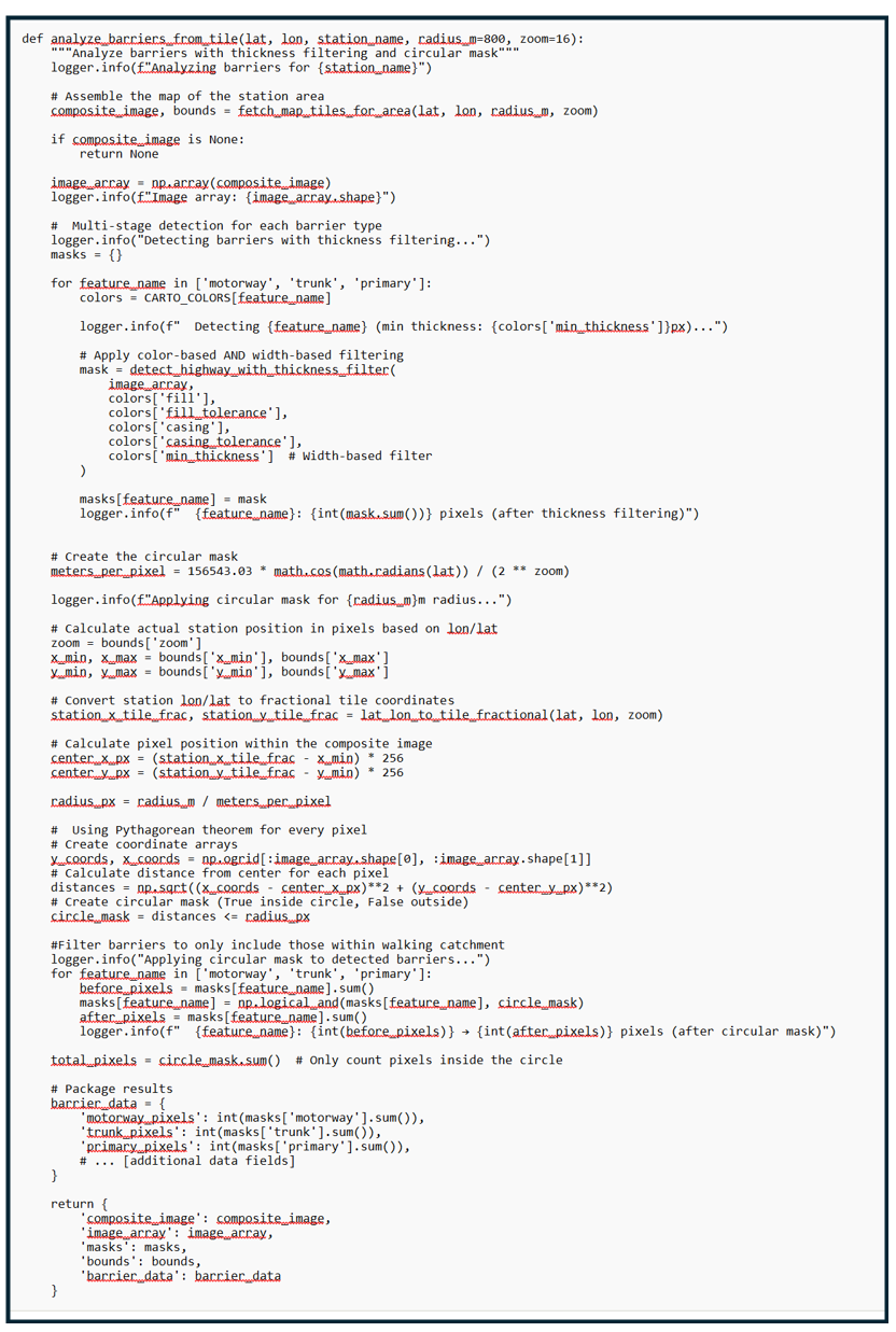
This is where all the pieces come together. The function first assembles the map of the station area, then runs the multi-stage detection process for each type of barrier (motorways, trunk roads, primary roads), applying both color-based and width-based filtering to identify genuine obstacles.
The downloaded map tiles form a rectangular area while planners typically draw a circle to estimate walking distance to and from a station in any direction. To ensure we're only measuring barriers that actually affect station access, we create a circular mask - essentially a digital cookie cutter that says "only count what's inside the 800-meter walking radius."
Using the Pythagorean theorem, the code calculates the distance from the station to every single pixel in the image, then filters the detected barriers to include only those within the walking catchment area.
The Sidewalk Problem: Filtering by Thickness and Color
Early versions of this analysis had a problem: sidewalks and small residential streets were being mistakenly identified as major barriers. This happened because OpenStreetMap renders sidewalks in very light colors that were similar enough to the road colors we were detecting.
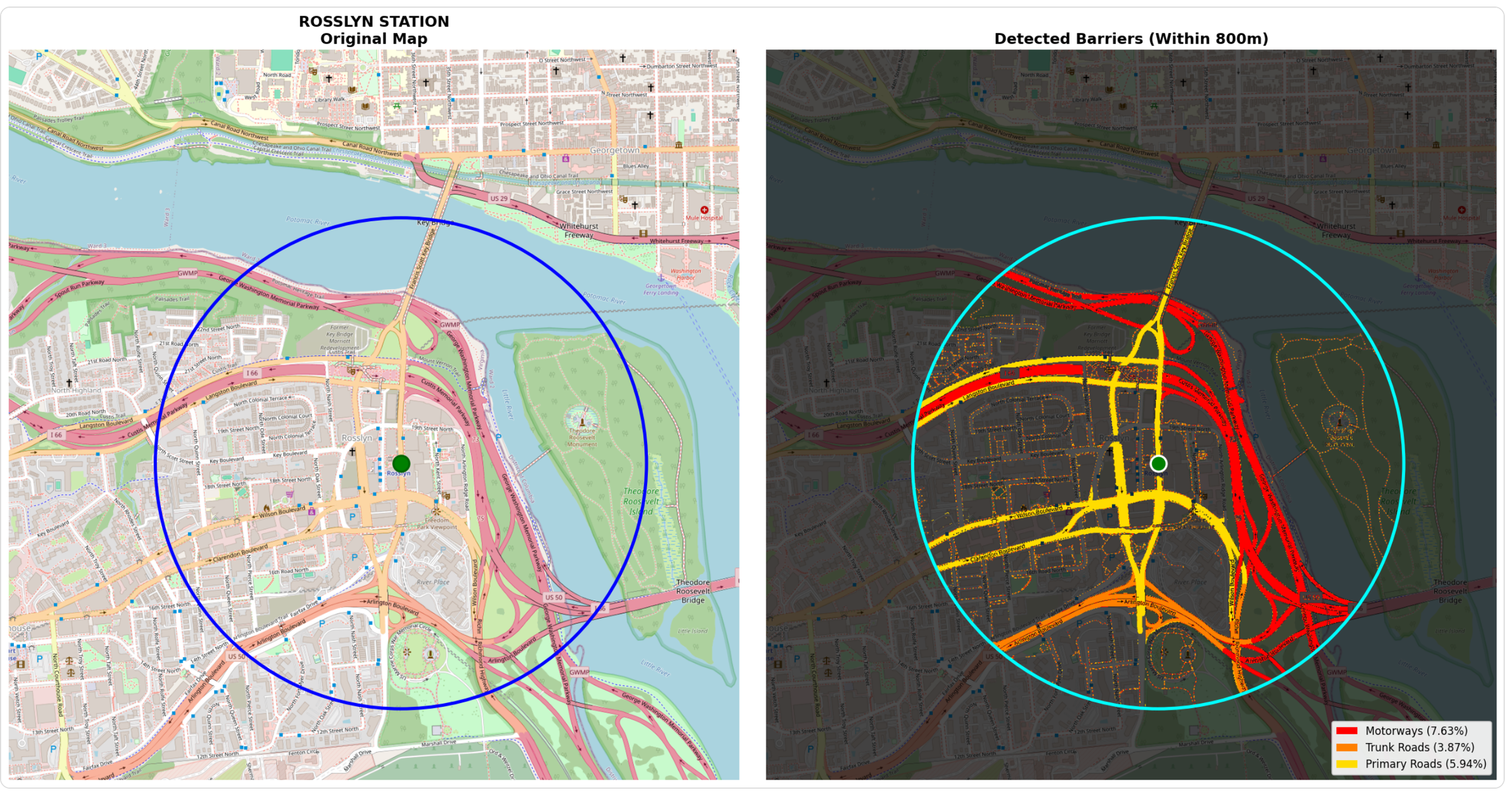
The images below show the Rosslyn Metro Station surrounded by motorways, trunk roads, and primary roads. If you look closely at the image on the left, you will see small dashed reddish/pinkish lines representing sidewalk coverage. My initial computer vision mask accurately captures these large roadways but also shades in the sidewalks and counts sidewalk area towards the amount of land occupied by motorways.
I solved this with two complementary filters. First, a color-based filter identifies and excludes very light gray pixels - the kind used for sidewalks and concrete surfaces. Second, a width-based filter removes any remaining thin lines, since true barriers like motorways are rendered much wider than sidewalks (8+ pixels vs 1-2 pixels).
Step 5: Measuring Results
Once barriers are detected within the walking catchment, the analysis converts raw pixel counts into three meaningful metrics: the actual pixel count (what the computer detected), the land area that the pixel count for each roadway type represents, and percentage of the circular area covered by each barrier type (useful for station-to-station comparisons).
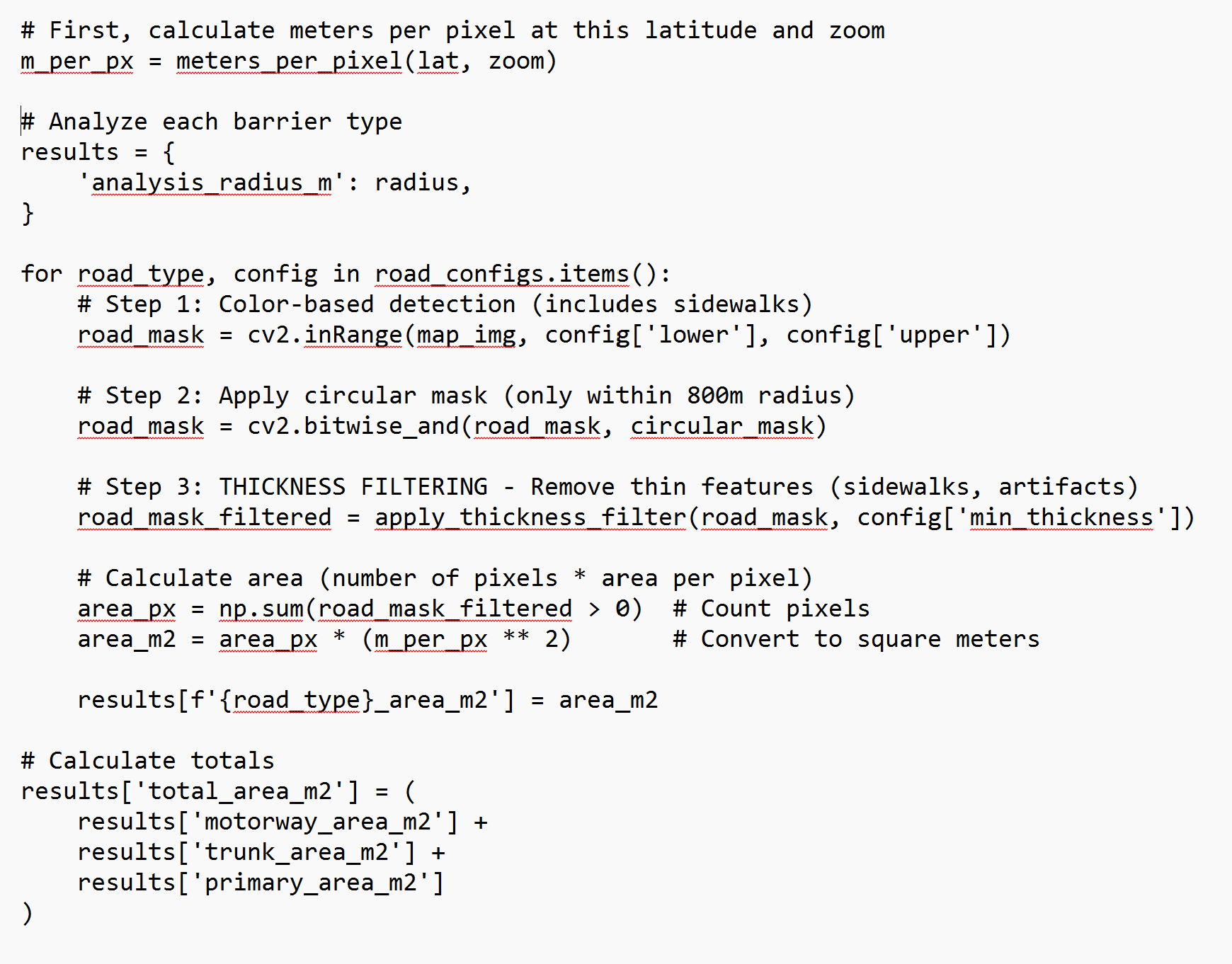
This code snippet counts how many pixels passed all filters, converts to square meters using the squared conversion factor. Data is stored for motorways, trunk roads, and primary roads separately
Step 6: Visualizing Results
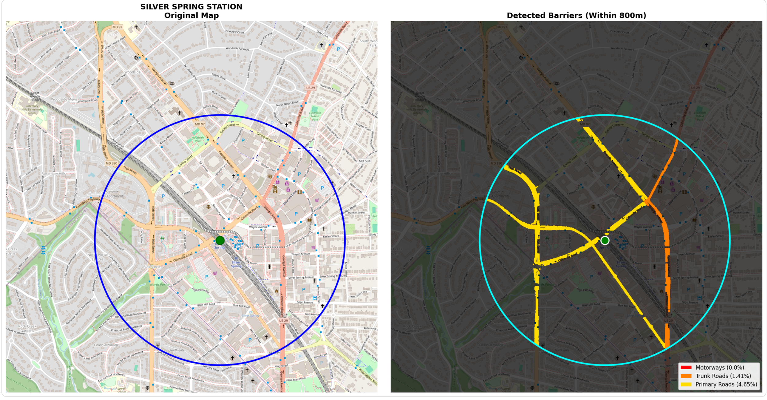
While my first priority is providing National Transit Station Atlas with data on the amount of land around transit stations occupied by major roads, I’m also interested in generating a data visualization that highlights the presence of these roads (if they exist). To do this, I wrote code that provides two images: one on the left which is a standard Carto basemap showing a transit station and a 1/2 mile radius, and one on the right which is a stylized version that accentuates the roadway barriers.
My prior code had to identify the precise RGB values of each roadway type to gather complete and accurate data on major roads near transit, but with this data in hand, I have the creative freedom to display them in whatever color I choose. Per the code below, I chose distinct colors optimized for human perception with a severity gradient (red → orange → yellow) that anyone can understand at a glance.
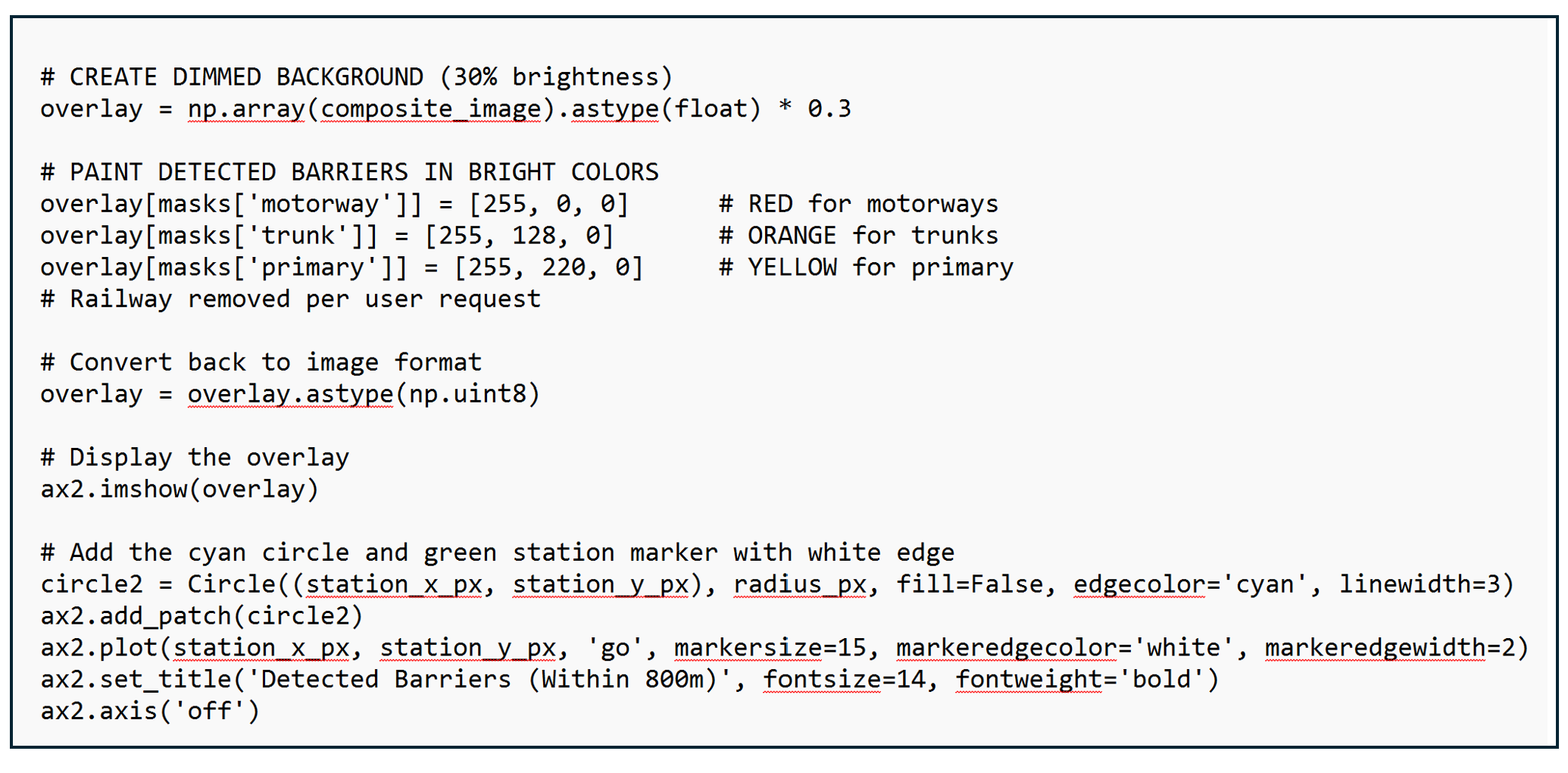
The visualization presents a side-by-side comparison. The left panel shows the original map with the 800-meter walking circle and station location marked. The right panel shows the same geography dimmed to 30% brightness, with detected barriers painted in bold colors. This side-by-side format allows stakeholders to instantly verify the analysis makes sense and understand the severity and spatial distribution of barriers around each station.
It feels odd to have spent all that effort reverse-engineering OSM's exact RGB values, dealing with anti-aliasing artifacts, tuning tolerances, just so I could throw those colors away and use simple red/orange/yellow. But I believe it is the correct choice. OSM Carto colors are designed for aesthetic cartography - they need to look pleasant on a map where you're showing buildings, parks, water, roads all at once. Subtle pastels work well for that. My visualization is designed for data communication, to help readers instantly understand the magnitude and severity of roadway barriers around transit stations.
The Hidden Challenge: Label Interface
You may have noticed that my map on the right that displays roadways in bright colors has some gaps where the reds and yellows are not completely filled in. When you take a look at the image on the left, you’ll notice that these gaps correspond to OSM’s roadway text labels.
These labels pose a fundamental challenge to my RGB color detection process. Since they are not in any of the colors associated with my roadway types, my computer classifies them as “not roadway” and skips them.
This means my measurements are actually conservative estimates - the true road area is slightly larger than what I detect. For a motorway with its name written across it, I might miss 5-10% of the actual roadway width where the label sits. (My website includes this caveat: "Text Label Interference: When OpenStreetMap places road names or labels directly on top of roadways in the imagery, those pixels are not counted as road surface, leading to an underestimate of the actual roadway width.").
Another Challenge: Identifying and Mapping Rail Lines
In many locations, railways also pose a barrier to accessing transit stations. For example, in Silver Spring, the rail line used by the WMATA red line and freight lines divide the area around the station and make it difficult for people living south of the station to easily walk to transit (planners have proposed a bridge over the tracks to remedy this obstacle). But my computer vision approach to quantifying and displaying land occupied by railway lines is more difficult because OSM Carto renders rail lines as small black lines very similar to other black lines used on the map. This results in many “false positives” where other land uses marked by black lines are counted as rail. The challenge is likely not insurmountable but not yet one that I’ve had the time or energy to solve.
Help Me Solve the Label and Railroad Problems
I would like help to upgrade my roadway visualizations to fill in the gaps associated with label interfaces to eliminate the distractions and make the visuals more compelling. If you are interested in computer vision and want to improve on this work, the label interference problem is a great challenge to tackle! One strategy could be using Optical Character Recognition (OCR) or text detection algorithms to identify where labels appear on the map, then "fill in" those pixels with the road color they're covering. Context based interference or morphological closing are other options. Another option might be to train a neural network to recognize road types directly from map images, learning to classify pixels as "motorway" even when labels are present.
If you are interested in helping me solve the label problem, email connect@transitdiscoveries.com. I’d reward the best solution with a small cash prize, implement it in the Atlas, and give credit to the person who developed it.
Lessons Learned
1. Sometimes the "wrong" approach is actually right. My initial instinct was to work with OpenStreetMap's raw vector data - the mathematically precise geometries that seemed like the "proper" way to analyze roads. But the rendered map tiles, which I initially dismissed as a simplification, turned out to be the better data source. The rendering engine had already solved the hard problems of varying road widths, complex interchanges, and visual accuracy. This taught me that the most elegant solution isn't always the most technically sophisticated one.
2. Iteration reveals hidden problems. The sidewalk problem didn't appear until I started seeing results. My initial color detection was technically correct but practically flawed - it found every pixel matching motorway colors, including sidewalks rendered in similar shades. Adding thickness filtering was essential, but I only discovered this need through testing real stations. Good analysis requires building something that works, examining the failures, and iterating.
3. Standardization is a superpower. OSM Carto's consistent global color scheme is what makes this entire approach possible. Because every motorway worldwide renders in RGB (226, 122, 143), I can write code once that works everywhere Th. is standardization enables automated analysis at scale. It's a reminder that seemingly mundane technical standards can unlock powerful capabilities.
4. Conservative estimates beat false precision. My analysis underestimates road area because of label interference and edge effects. I could spend weeks building more sophisticated algorithms to detect and fill in text labels, or to better handle anti-aliasing at road edges. But the current approach gives me consistent, comparable data across thousands of stations. Sometimes "roughly right and widely applicable" beats "perfectly accurate but complex and fragile." I document the limitations clearly rather than claiming false precision.
5. Open source tools democratize sophisticated analysis. Twenty years ago, this kind of computer vision analysis would have required expensive proprietary software and specialized expertise. Today, I built it using entirely free, open-source tools: Python, NumPy, OpenCV, and OpenStreetMap. The democratization of both data (OSM) and tools (scientific Python) means individual researchers and advocates can conduct analyses that once required institutional resources. This accessibility matters for equity - small transit agencies and community groups can now do work previously limited to well-funded consultants.
Want to explore the data yourself? Visit the National Transit Station Atlas to see barrier analysis for stations nationwide. And you can download the roadway data for 5,100 stations on the Atlas’s data page.
Interested in improving this analysis? I'm offering a cash prize for solutions to the label interference problem and railroad detection challenges. Email connect@transitdiscoveries.com to learn more